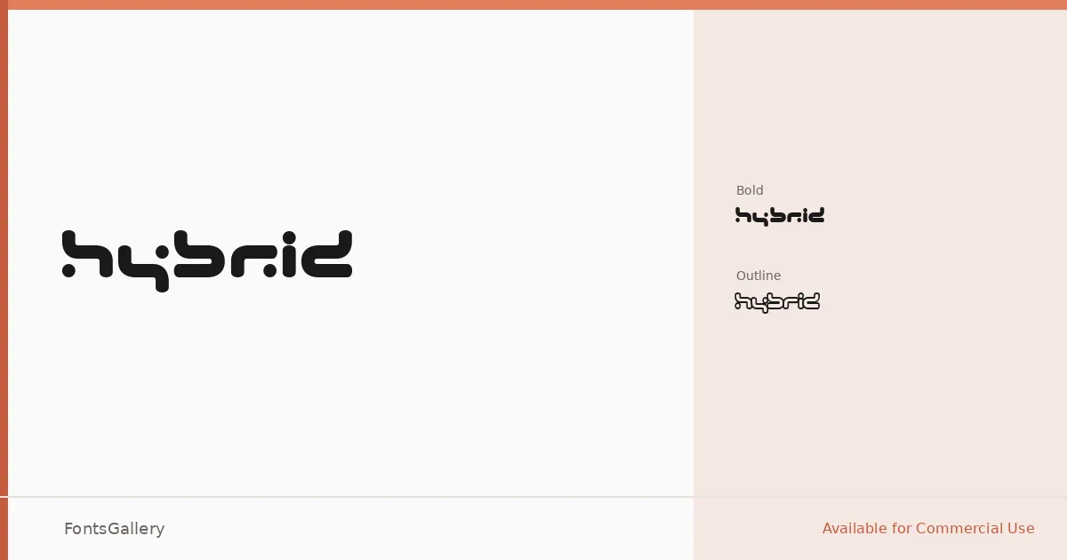
About Hybrid Font
There is an assertive mechanical tension running through these letterforms — the kind that reads immediately as intentional, not accidental. Created by Ola Björling of beyond design, the family arrives in two distinct expressions: a solid Bold weight and an Outline counterpart, each in a single Regular cut, delivered as TTF files.
Design Aesthetics & Character Characteristics
This is a display face built for impact, sitting squarely in futuristic and modern territory. The Bold carries the full weight of its construction, dense and direct, while the Outline version opens up that same geometry into something airier without losing any of its edge. Together the two cuts give you a controlled range — from heavy fills to skeletal line work — within a single coherent Latin character set.
Recommended Usage & Font Pairing
The face earns its place in branding systems, logo lockups, poster headlines, website headers, and apparel graphics where a hard, forward-leaning voice is needed. For contrast in longer layouts, it sits well alongside Helvetica's rational neutrality; Aresink, Alexandria, Bizantheum, and Audex are also listed as companions worth considering depending on the tone of the surrounding design.
License & Usage Terms
This family is available for commercial use under its stated license. Note that embedding permissions are restricted, so confirm those constraints before placing the font inside packaged documents or applications.