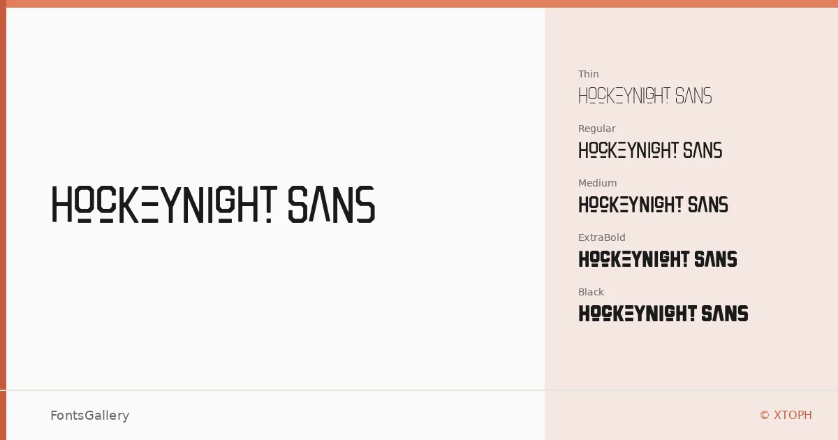
About Hockeynight Sans Font
There is something immediately forceful about these letterforms — a condensed, muscular energy that sits somewhere between arena signage and contemporary editorial design. XTOPH, the designer and foundry behind the face, has built a display sans with enough structural tension to hold its own at large sizes while staying disciplined enough not to collapse into novelty.
Design Aesthetics & Character Characteristics
The family runs a full weight range — Thin and Thin Italic through Light, Regular, Medium, Bold, ExtraBold, and Black, each with a matching italic — giving you genuine tonal range within a single display system, all delivered as OTF files. The mood sits at the intersection of grunge and modern professional: there is roughness in its character but a geometric backbone that keeps headlines organized and logos legible. At lighter weights it carries a stripped-back editorial quality; pushed to Black Italic, it reads as something closer to a rally poster or a jersey number.
Recommended Usage & Font Pairing
The weight range and grunge-edged confidence make it well suited to headline work, branding identities, poster campaigns, logo lockups, and T-shirt graphics — anywhere Latin-script copy needs to command a surface rather than simply occupy it. It pairs naturally with the softer curves of Canela or ABC Arizona when contrast is the goal, and holds its own alongside Helvetica, Bahnschrift, or Etna when you want a stronger typographic family feel.
License & Usage Terms
Hockeynight Sans is available under Personal Use terms, which means commercial use is not permitted — confirm licensing directly with XTOPH at www.x-toph.com before committing it to any client or commercial project.