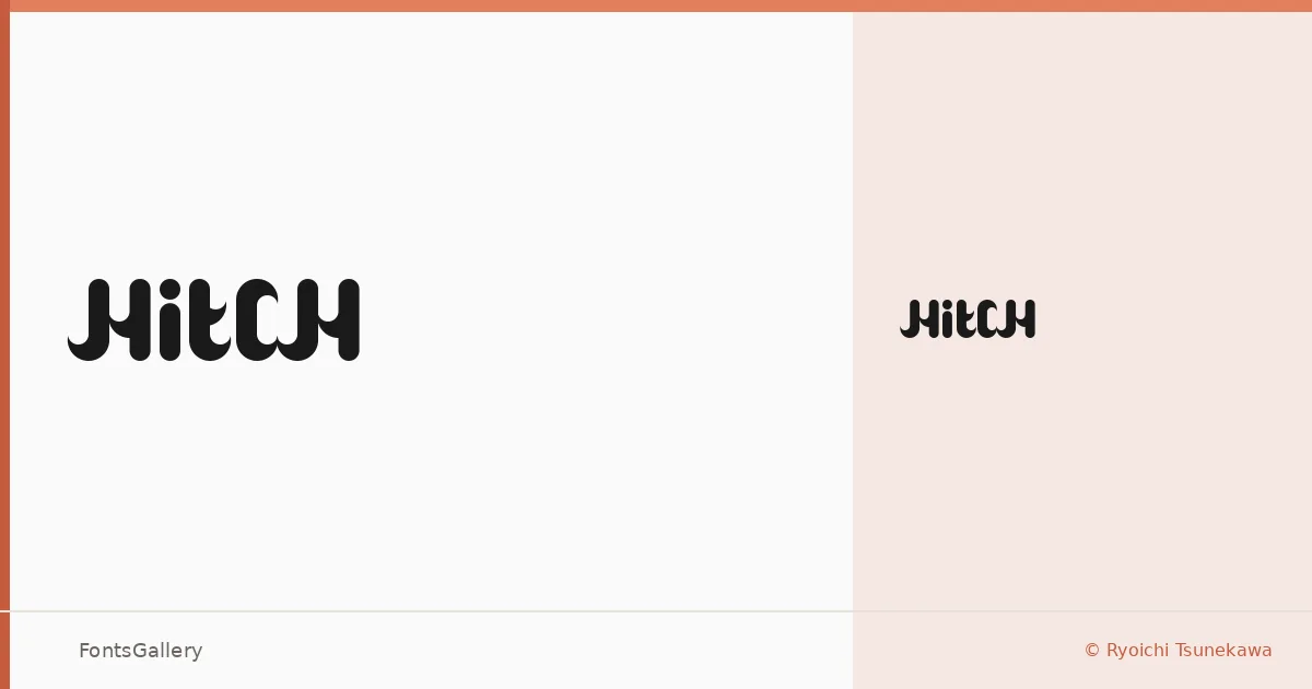
About Hitch Font
There is something deliberately charged about these letterforms — a display face from designer Ryoichi Tsunekawa that carries its weight with a kind of theatrical confidence. The single Regular cut arrives in TTF format, sharp-edged and built for impact rather than running text.
Design Aesthetics & Character Characteristics
Sitting squarely in the display category, Hitch reads as bold and modern while keeping a playful, whimsical edge that stops it from feeling corporate. The forms have the kind of personality you notice immediately at large sizes — the sort of character that works when the type itself needs to carry a mood. Coverage extends across Latin, Cyrillic, and Greek, which gives it reasonable reach for multilingual headline work.
Recommended Usage & Font Pairing
This is a face built for branding, posters, logos, and anything that lives at display scale — including T-shirt graphics where attitude matters as much as legibility. The playful tension in the letterforms pairs well with something cleaner underneath: Bahnschrift or Helvetica for a rational counterweight, Canela or Times New Roman when you want warmth alongside the bravado, and Etna if you prefer staying closer to the expressive end of the spectrum.
License & Usage Terms
Hitch is offered under Personal Use terms, which means commercial use is not permitted — confirm licensing with the designer before committing it to any paid job. The file ships with editable embedding permission.