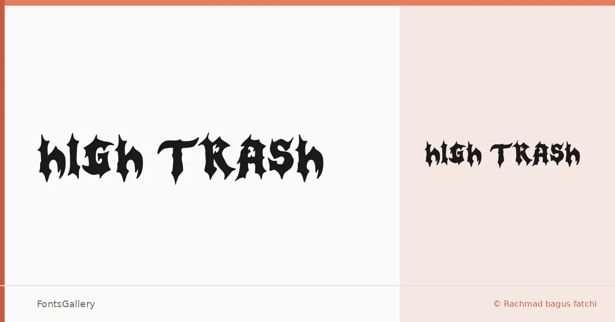
About High Trash Font
There is a deliberate roughness to these letterforms — edges that look torn, strokes that feel stamped rather than drawn — and that tension is exactly the point. High Trash is a single-weight display face designed by Rachmad Bagus Fatchi of Hello Good Studio, built for moments when polish would be a liability.
Design Aesthetics & Character Characteristics
The family ships as one cut — Regular — in OTF format, which keeps the proposition simple: you get one strong voice with a grunge, rustic character that leans vintage without drifting into nostalgia pastiche. The letterforms carry the kind of bold, distressed energy that reads confidently at headline scale, where every rough edge registers as intention rather than accident.
Recommended Usage & Font Pairing
It earns its keep on posters, apparel graphics, logos, and social media visuals where the brief calls for something with grit and attitude — branding that needs to feel handmade or street-worn rather than corporate. Latin coverage handles the essentials for those contexts. Pair it against the clean geometry of Helvetica or Bahnschrift for hard contrast, or try it alongside the editorial refinement of Canela or ABC Arizona to let the roughness breathe; Etna offers a middle ground with its own display character.
License & Usage Terms
This family is available for commercial use under the terms listed at studiohellogood.com, with installable embedding permissions included.