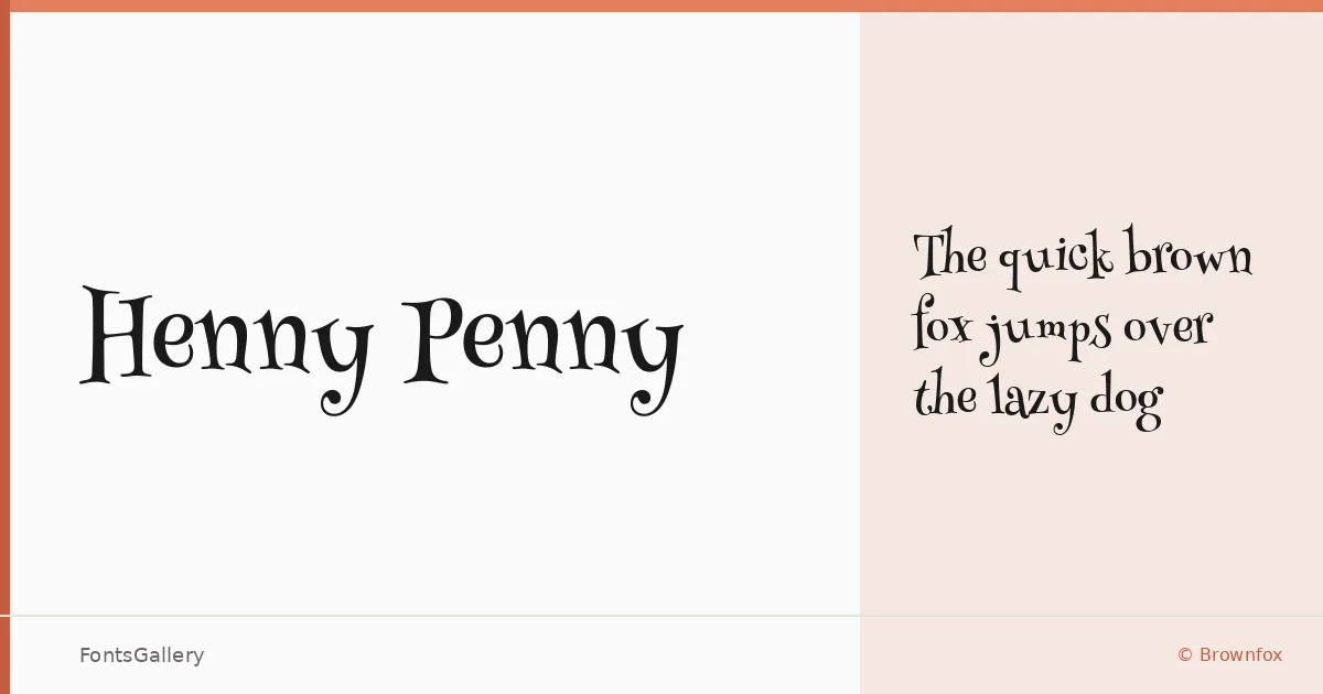
About Henny Penny Font
There is a looseness to the letterforms here — an almost storybook wobble that feels deliberate and warm rather than naive. Designed by Olga Umpeleva for Brownfox, this single-weight display face carries the spirit of mid-century illustrated print: ink-pressed, slightly irregular, and full of personality. The Latin character set is delivered as a TTF, ready to drop straight into a project.
Design Aesthetics & Character Characteristics
It sits squarely in the display category, with a mood that moves between classic and whimsical — vintage in its bones but playful in how the strokes settle on the baseline. The sole Regular weight means there is no range of cuts to navigate; what you get is one well-considered voice, and it is a confident one. The forms reward larger sizes, where the subtle irregularities read as craft rather than accident.
Recommended Usage & Font Pairing
The obvious territory is children's books and greeting cards, where the whimsical quality lands naturally, but the vintage weight of the lettering also makes it a strong candidate for book covers and branding that wants a handcrafted, approachable tone. Posters benefit from the display proportions at headline scale. For body copy or supporting text, it pairs well with cleaner companions — Helvetica or Josefin Sans for a neutral contrast, Asap for something warmer, or Canela and ABC Arizona when the project calls for a more editorial feel.
License & Usage Terms
Released under the SIL Open Font License, Version 1.1, which permits commercial use — full terms and the accompanying FAQ are available at http://scripts.sil.org/OFL. Embedding is set to installable, so distribution inside documents and applications is covered.