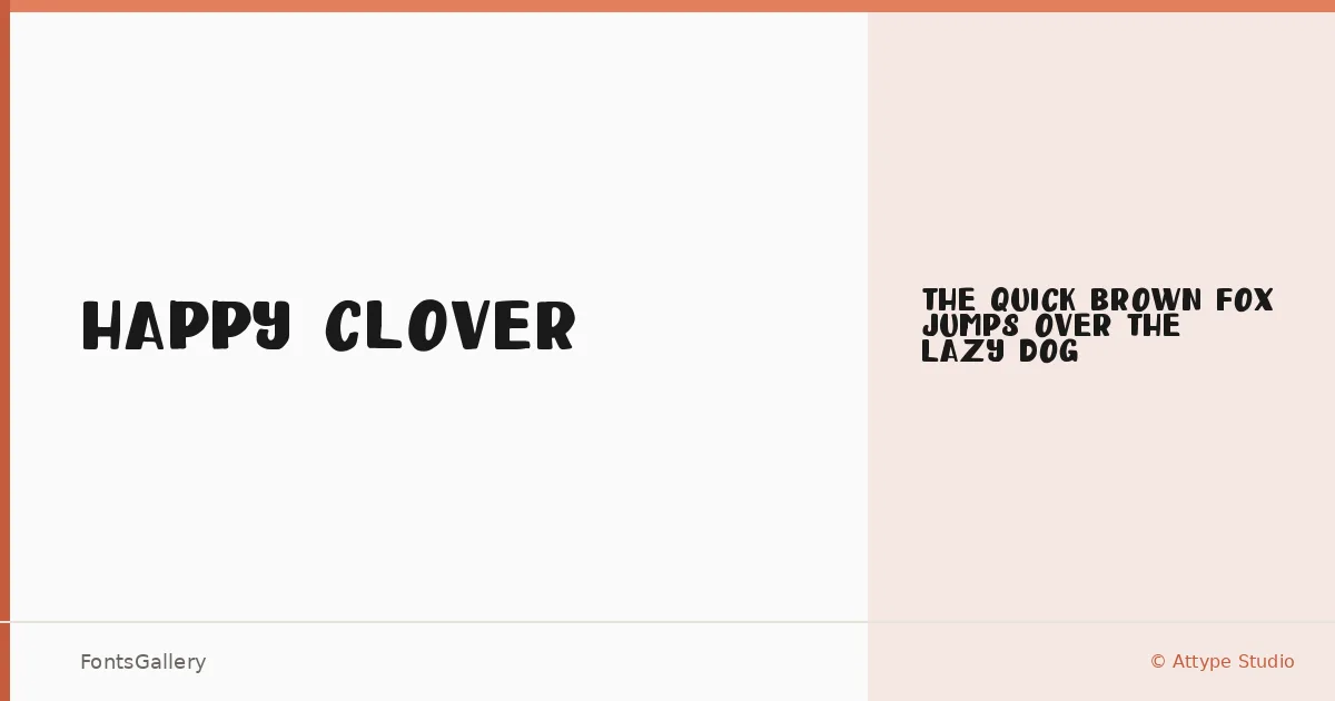
About Happy Clover Font
There is an unmistakable bounce to this display face — letters that lean into playfulness without tipping into chaos. Attype Studio drew a single style, Happy Clover Display Regular Display, keeping the focus tight and the personality loud. The forms carry a whimsical energy that reads immediately, even at a glance.
Design Aesthetics & Character Characteristics
This is a bold, whimsical display design built for moments that need warmth and a light touch. The single Regular Display cut ships as a TTF, so there are no weight decisions to agonize over — the family commits fully to one expressive voice. Its rounded, playful character suits headlines and short bursts of text far better than running copy, which is exactly what a display cut should do.
Recommended Usage & Font Pairing
Children's books, greeting cards, social media graphics, and branding work that needs an approachable, cheerful tone are the natural home for these letterforms. It handles poster headlines well wherever the brief calls for something that feels handcrafted and warm rather than corporate. For contrast, it pairs with the clean structure of Helvetica or Bahnschrift, or the editorial softness of Canela, Etna, and ABC Arizona — any of which will ground the composition without flattening the mood.
License & Usage Terms
Happy Clover is released under a Personal Use license, which means commercial use is not permitted — confirm licensing terms with Attype Studio before taking it into a paid project.