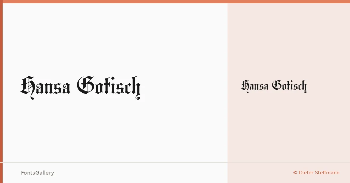
About Hansa Gotisch Font
There is something immediately commanding about a well-drawn blackletter — the dense verticals, the broken strokes, the sense that every letter carries historical weight. This face, drawn by Dieter Steffmann and released under the Typographer Mediengestaltung copyright, delivers exactly that: a single Regular cut rooted in the Germanic Fraktur tradition, with the kind of structural authority that Latin blackletter does at its best.
Design Aesthetics & Character Characteristics
The mood sits squarely in classic and vintage territory, but with enough grit to read as grunge when set large. The bold strokes and sharp diamond terminals give it a presence that holds up on coarse materials and high-contrast layouts alike. As a TTF in one style, it is a focused tool rather than a system — you use it for the weight it carries, not for hierarchy across a range of cuts.
Recommended Usage & Font Pairing
It earns its place in branding work, poster headlines, logo lockups, certificate typography, and T-shirt design — any context where Latin letterforms need gravitas rather than neutrality. For pairing, the contrast-heavy blackletter pairs well against the clean geometry of Helvetica or Bahnschrift, and sits interestingly alongside the editorial softness of Canela or ABC Arizona; Etna offers a rougher, more textural counterpoint if the job calls for it.
License & Usage Terms
Hansa Gotisch is available for commercial use. Note that embedding permissions are restricted, so review those constraints before incorporating the TTF into documents or applications that distribute embedded font data.