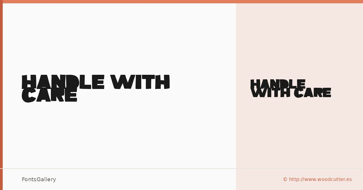
About Handle With Care Font
There is a deliberate roughness to this display face — the kind that looks like it was pulled from a distressed rubber stamp or a battered woodblock rather than drawn with a bezier curve. It comes from Woodcutter Manero, whose work carries a consistent handmade tension between grunge and control. The single Regular cut is delivered as an OTF, tight and focused in its intent.
Design Aesthetics & Character Characteristics
The mood sits somewhere between vintage decay and modern aggression — bold strokes with irregular edges that read as grunge without losing legibility at headline sizes. That combination of worn texture and confident weight gives it real presence in the display category, where subtlety would work against it. There is only one style in the family, so the character of the letterforms has to carry the full range of any composition it enters.
Recommended Usage & Font Pairing
It earns its keep in branding work, poster headlines, logo treatments, and T-shirt design — anywhere a raw, assertive Latin-script mark is the point. The texture reads particularly well at large sizes where the imperfections become part of the message rather than noise. For contrast and balance, the listed pairing options cover a wide range: the editorial softness of Canela or ABC Arizona, the clean Swiss neutrality of Helvetica or Bahnschrift, and the structured display character of Etna each offer a different way to anchor its energy.
License & Usage Terms
Handle With Care is released under Personal Use terms — commercial use is not permitted, so confirm licensing before taking it into a paid project by contacting Woodcutter Manero directly at [email protected] or via http://www.woodcutter.es.