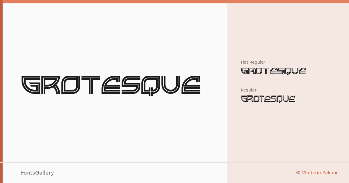
About Grotesque Font
There is something deliberately confrontational about these letterforms — the kind of display type that refuses to settle quietly into a layout. Vladimir Nikolic designed this two-style family, and the distinction between its two cuts is worth noting: Grotesque Regular and Grotesque Flat Regular sit side by side as two readings of the same underlying idea, the Flat variant shearing away certain curves to push the industrial quality further.
Design Aesthetics & Character Characteristics
This is a display family that draws from both vintage grotesque traditions and a futuristic, modern sensibility — a tension that gives it real character. The two styles ship as TTF files and carry a bold, direct mood that reads best at headline scale, where the forms have room to assert themselves. That flatness in the Flat Regular cut in particular has a mechanical, almost stencil-like quality that separates it from ordinary sans display type.
Recommended Usage & Font Pairing
Branding systems, posters, logos, and T-shirt graphics are natural territory here — anywhere the type needs to carry visual weight on its own without supporting text doing the heavy lifting. For text underneath or alongside, the family pairs well with Canela or ABC Arizona when you want contrast through warmth, and with Helvetica or Bahnschrift when you want to stay firmly in the grotesque register. Etna is another listed companion worth considering for editorial headline pairings.
License & Usage Terms
This family is available for commercial use under its current license, though embedding is restricted to preview and print — interactive or editable embedding is not permitted, so factor that in for any web or app deployment.