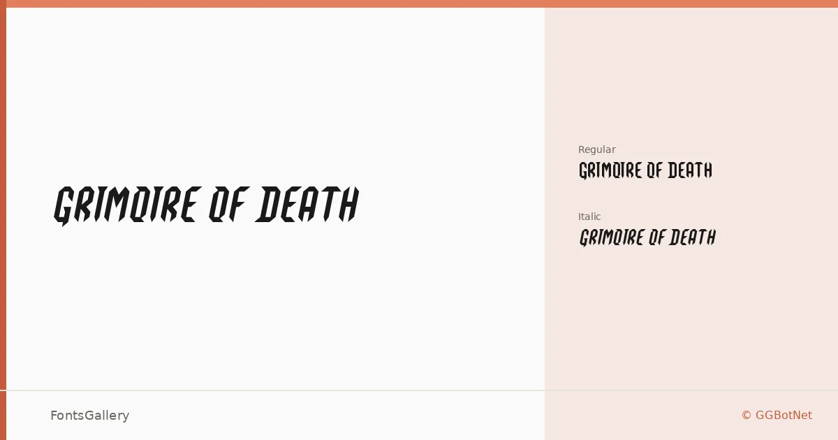
About Grimoire Of Death Font
There is something deliberately archaic about these letterforms — the kind of weight and texture you associate with hand-lettered occult manuscripts or the spine of a 19th-century horror novel. GGBotNet designed this display family with two cuts: a Regular and a companion Italic, both delivered as TTF files. The forms carry that grunge-meets-vintage character without tipping into pure distortion, keeping just enough structure to hold up at headline sizes.
Design Aesthetics & Character Characteristics
This is a bold, classic display face with clear grunge and vintage leanings — the kind of type that reads as aged and deliberate rather than clean or neutral. The Regular stands upright with a confident, heavy presence, while the Italic introduces movement and a slightly more dramatic tension. Latin script is the scope of coverage. Neither cut is meant for body text; both are built around the punch of a single word or a short phrase set large.
Recommended Usage & Font Pairing
Book covers, posters, and T-shirt designs are the obvious homes — anywhere a headline needs atmosphere rather than approachability. Logo work and editorial titles for dark, vintage, or countercultural themes are equally strong fits. For contrast, it pairs well with the clean neutrality of Helvetica or Josefin Sans, and equally well against the editorial warmth of Canela or ABC Arizona; Asap offers a more workmanlike middle ground when the layout calls for extended body copy alongside the display weight.
License & Usage Terms
Released under the SIL Open Font License, Version 1.1, this family is free for commercial use with installable embedding permitted — full terms are available at https://scripts.sil.org/OFL.