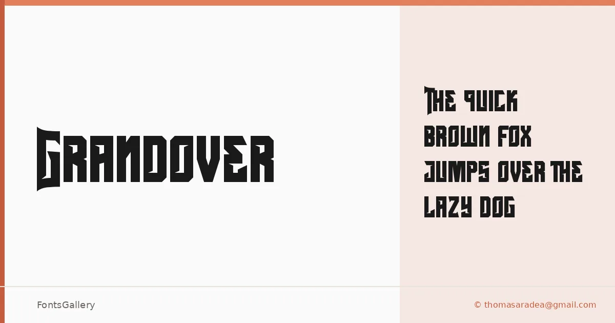
About Grandover Font
There is a roughness to this display face that feels deliberate — the kind of worn, hand-pressed quality that evokes old broadside posters and ink-heavy letterpress work. Grandover is a single-weight display typeface from Letterara, and its Regular cut carries enough visual weight to hold a composition on its own. The letterforms lean into grunge and vintage territory without tipping into pastiche.
Design Aesthetics & Character Characteristics
Bold and classic in temperament, it sits comfortably in the display category — built for sizes where texture and character read clearly, not for body copy where that same roughness would become noise. The single Regular style ships as a TTF file. What it lacks in a weight range it makes up for in personality: the forms have a confident, slightly battered authority that suits headline work well.
Recommended Usage & Font Pairing
It earns its keep on posters, in branding systems that want a vintage or grunge edge, on logo lockups, and across T-shirt design work where the Latin character set is all you need. For contrast, the listed pairing options — Helvetica, Aresink, Alexandria, Bizantheum, and Audex — offer clean or complementary companions that keep the composition balanced rather than competing with its texture.
License & Usage Terms
This family is released under a Personal Use license — personal-use terms only, with embedding restricted, so confirm licensing directly with Letterara at letterara.com before committing it to any commercial job.