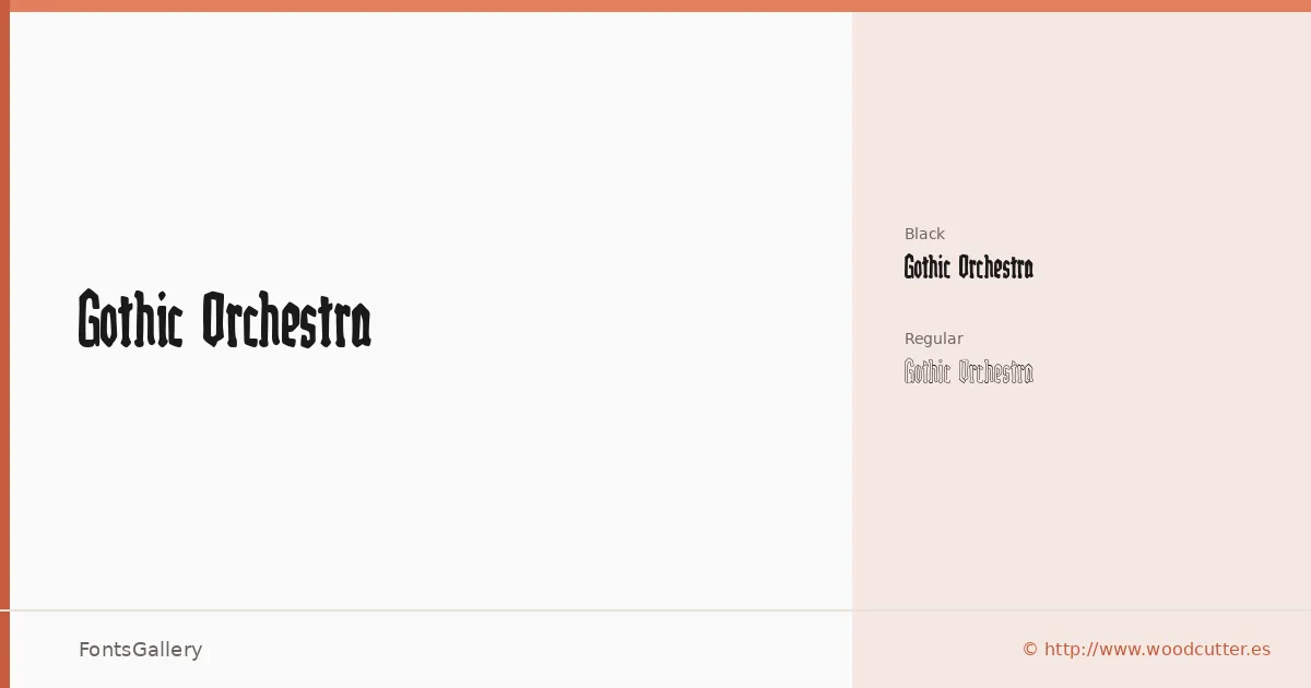
About Gothic Orchestra Font
There is a deliberate heaviness to these letterforms — the kind that belongs on a broadside or a band poster, where blackletter tradition meets something rawer and more immediate. Gothic Orchestra comes from Woodcutter Manero's Fonts Lab, released in 2025, and it arrives in two cuts: Regular and Black. The Black weight especially presses into the baseline with the authority of old Gothic woodcuts, while the Regular holds just enough air to stay legible at display sizes.
Design Aesthetics & Character Characteristics
This is a blackletter family built around a bold, classic sensibility with genuine grunge and vintage undertones — not as decoration but baked into the stroke endings and the texture of the forms themselves. Both styles are delivered as OTF files covering the Latin script. At the Regular weight the family can carry a headline with period dignity; push to Black and the mood shifts into something louder, more confrontational, suited to a moment when you need the type to do real work before a single image loads.
Recommended Usage & Font Pairing
The natural territory here is branding, logo work, poster design, and T-shirt graphics — anywhere a Latin-script headline needs historic weight with an edge. The contrast between its dense strokes and a clean geometric or humanist companion is where it earns its keep; it has been paired effectively with Canela, Etna, Helvetica, ABC Arizona, and Bahnschrift, each of which offers a different kind of relief against the blackletter density.
License & Usage Terms
Gothic Orchestra is released under Personal Use terms — commercial use is not permitted, so confirm clearance before taking it into any paid project by contacting Woodcutter Manero directly at [email protected] or via http://www.woodcutter.es.