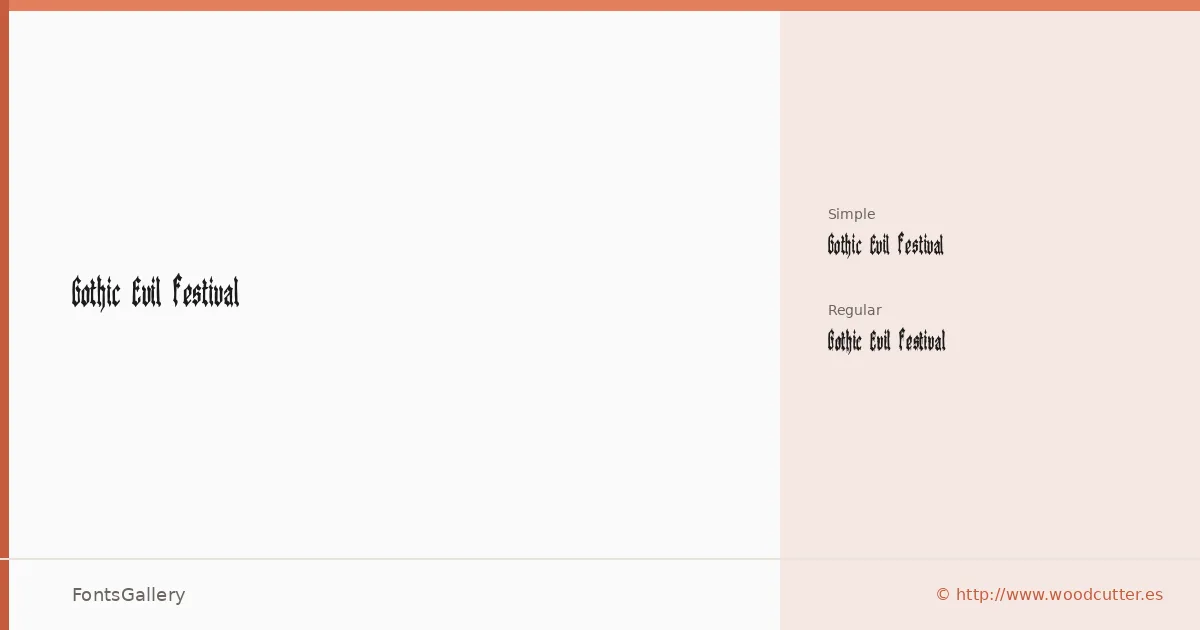
About Gothic Evil Festival Font
There is a rawness to these letterforms that feels deliberately earned — jagged edges, grunge-inflected strokes, and the kind of visual weight that commands attention before a single word is read. The family comes from Woodcutter Manero, whose Fonts Lab work carries a consistent handmade intensity. It ships in OTF format across two cuts: the full-detail Regular and the cleaner Regular Simple.
Design Aesthetics & Character Characteristics
This is a display family in the classic gothic tradition, pushed into darker, more expressive territory through grunge texture and vintage distress. The Regular cut leans into that roughness fully, while Regular Simple strips back the detail for contexts where the underlying structure needs to breathe. Both share the same bold, confrontational skeleton — broad, dramatic, and built for scale. Latin script is supported throughout.
Recommended Usage & Font Pairing
The natural home for these cuts is anywhere the brief calls for impact: festival posters, band branding, headline treatments, logo lockups, and T-shirt graphics where the type needs to carry the room on its own. When you need contrast at body or subhead size, the family has been paired successfully with Canela, Etna, ABC Arizona, Helvetica, and Bahnschrift — each offering a different register of tension against the gothic weight above.
License & Usage Terms
Gothic Evil Festival is available under Personal Use terms only — confirm commercial clearance before any client or revenue-generating work by contacting [email protected] or visiting http://www.woodcutter.es. Embedding is permitted at the installable level.