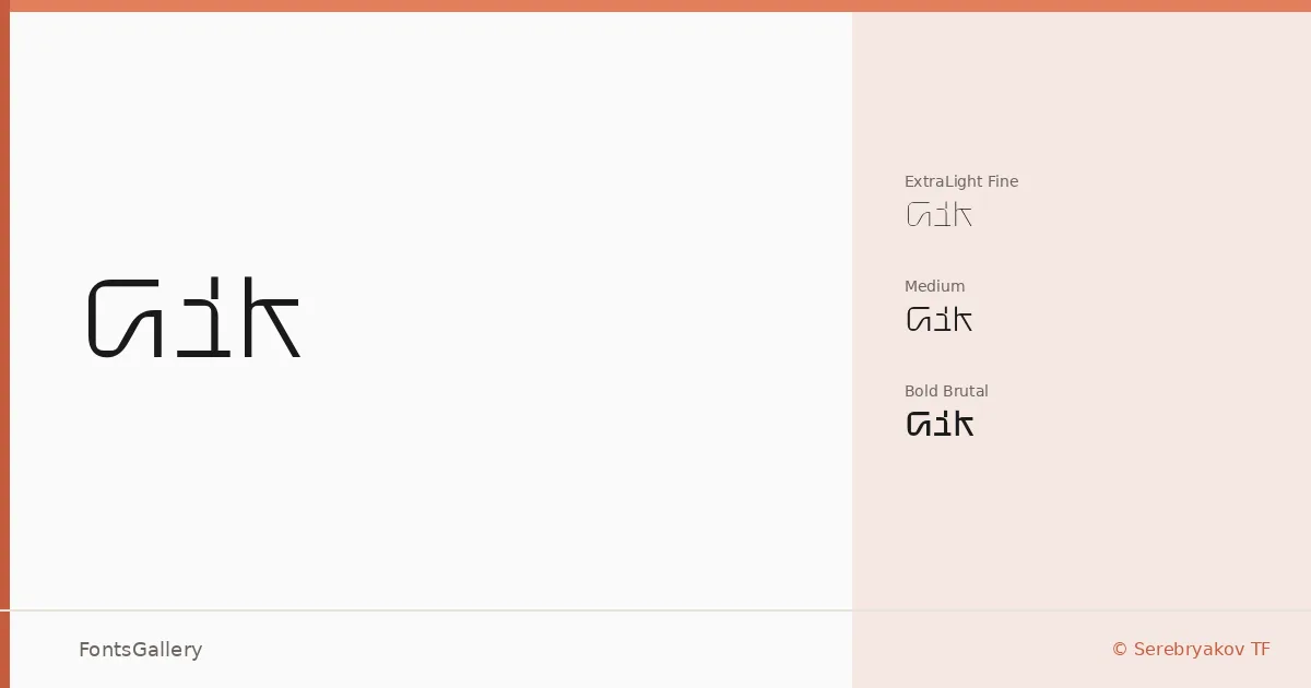
About Gik Font
There is something deliberately taut about these letterforms — geometry pulled tight, with almost no room for ornament. Denis Serebryakov of Serebryakov TF has built a display family around that tension, and it carries through every cut. The characters read as constructed rather than drawn, which gives the whole family a confident, almost industrial presence.
Design Aesthetics & Character Characteristics
Three styles define the range: Gik Fine at ExtraLight, Gik Medium at Regular, and Gik Brutal at Bold. The progression from Fine to Brutal is not simply a weight shift — the heavier cuts push into something rawer and more confrontational, while Fine stays minimal and airy. Across all three, the futuristic and modern sensibility holds steady, and the OTF files cover both Latin and Cyrillic, giving the family genuine reach across scripts.
Recommended Usage & Font Pairing
The family earns its place in headline work, poster compositions, branding systems, logo lockups, and T-shirt graphics — any context where the type needs to carry visual weight without decoration. Fine works where restraint matters; Brutal works where it does not. For pairing, the family sits well alongside Etna, Canela, Helvetica, ABC Arizona, and Bahnschrift, all of which offer enough contrast in texture or structure to let Gik lead without conflict.
License & Usage Terms
This family is distributed under a Demo license, which covers personal use only — confirm licensing terms directly with Serebryakov TF before placing it in any commercial work. Embedding is permitted at the editable level.