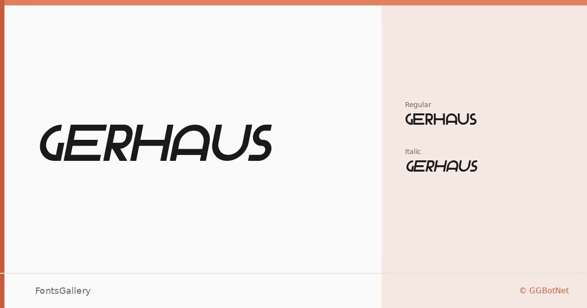
About Gerhaus Font
There is a sharp, architectural quality to these letterforms — the kind of geometry that feels deliberately constructed rather than drawn. Released under GGBotNet, Gerhaus arrives in two cuts: a Regular and a Regular Italic, both in TTF format, carrying coverage across Latin, Latin Extended (partial), Cyrillic, and Greek.
Design Aesthetics & Character Characteristics
This is a display face with a minimal, futuristic disposition — clean strokes, modern proportions, and a boldness that reads at scale without shouting. The italic doesn't simply slant the upright; it carries its own forward momentum, making the two cuts feel like a considered pair rather than an afterthought. Together they occupy that precise zone between editorial restraint and strong typographic presence.
Recommended Usage & Font Pairing
The design suits headline settings, poster work, logo treatments, magazine covers, and branding systems where a geometric, contemporary voice is needed — and the Cyrillic and Greek support extends that reach meaningfully across scripts. It pairs well with the neutrality of Helvetica or Bahnschrift, softens interestingly against the organic curves of Canela, and holds its own alongside the classical structures of Times New Roman or the editorial weight of Etna.
License & Usage Terms
Gerhaus is released under the SIL Open Font License, Version 1.1, which permits commercial use — full terms are available at https://scripts.sil.org/OFL. Embedding is set to installable, so documents and applications can carry the font without restriction under that license.