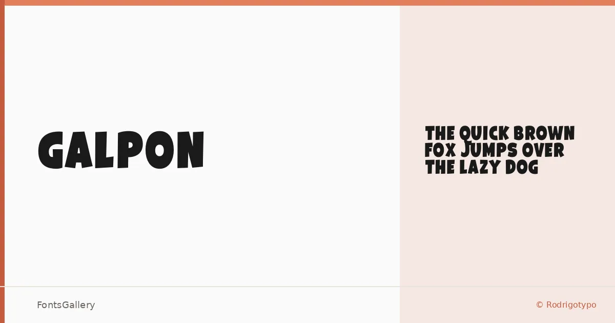
About Galpon Font
There is real conviction in the weight of this single cut — Rodrigo Araya Salas of Rodrigotypo built Galpon around a Black that leans into its mass rather than apologizing for it. The letterforms carry a bold, modern confidence with just enough looseness to read as playful rather than authoritarian.
Design Aesthetics & Character Characteristics
Sitting squarely in the Display category, Galpon Black is a single-style family delivered in OTF — no range of weights, just one decisive, heavy statement. The forms are clean enough to stay legible at large sizes while the overall color on the page stays dark and commanding. That combination of rigidity and personality gives it an energy that works especially well when a design needs presence without looking stiff. Language coverage spans Latin, Cyrillic, and Greek, which opens it up well beyond Western European work.
Recommended Usage & Font Pairing
The weight and character make it a natural fit for headlines, posters, branding systems, logo lockups, and T-shirt design — anywhere the type needs to carry the visual load at a glance. For text or support roles, it pairs well with the neutrality of Helvetica or Josefin Sans, the editorial refinement of Canela or ABC Arizona, and the friendlier rhythm of Asap. Mixing Galpon's density against a lighter companion is where the contrast really works.
License & Usage Terms
This family is distributed under a Demo license, which means it is for personal use only — confirm licensing terms directly with Rodrigotypo before committing it to any commercial project. Embedding is permitted at editable level.