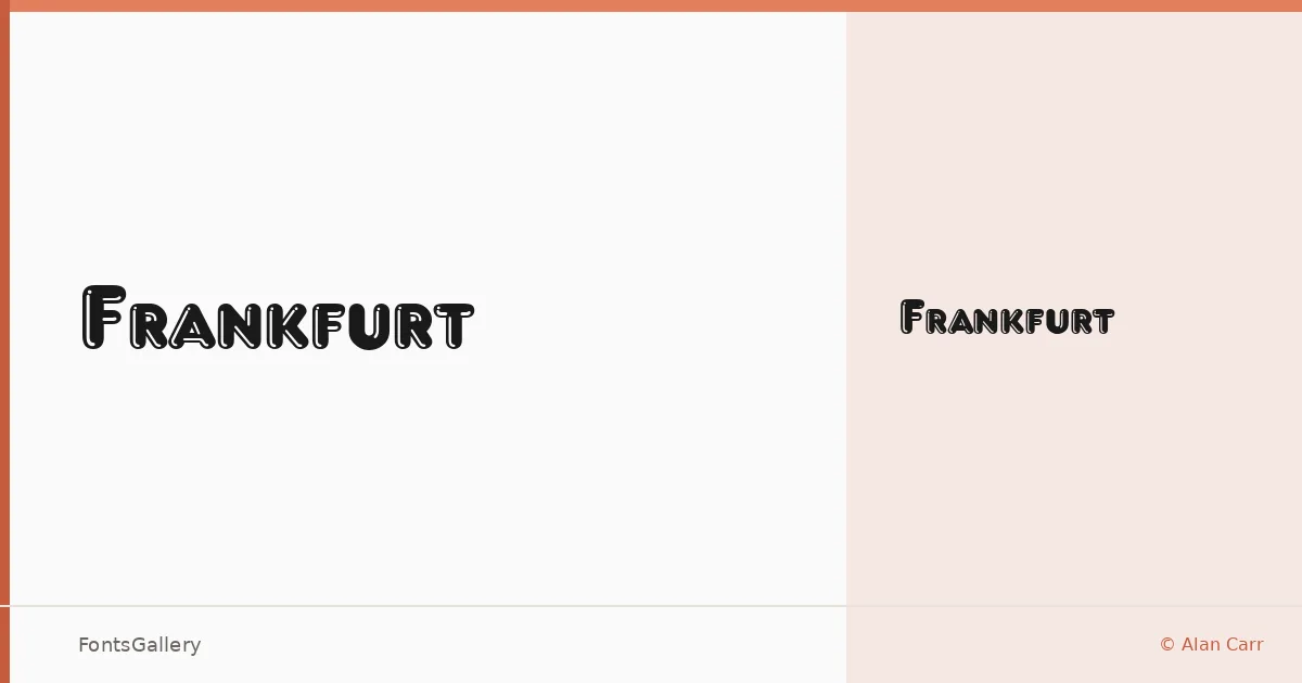
About Frankfurt Font
There is a deliberate heaviness to this display face — the kind of weight that reads across a room before anyone gets close enough to make out individual letters. Designed by Alan Carr and released as freeware under the Fantazia Fonts and Sounds trademark, it arrives as a single Regular cut in TTF format, built for impact rather than extended text setting.
Design Aesthetics & Character Characteristics
The mood sits squarely in bold, classic, vintage territory — think compressed blackletter-adjacent authority without necessarily committing to full gothic ornament. As a display category design, it carries the kind of confident historical weight that works when you need a headline to feel earned rather than manufactured. The single weight means you work with it as a statement cut, not a workhorse family.
Recommended Usage & Font Pairing
It earns its keep in branding, poster work, logo lockups, and T-shirt design — anywhere a headline needs a period feel with real visual muscle. For pairing, the clean rationalism of Bahnschrift or Helvetica creates useful contrast against its vintage character, while Canela brings a softer editorial counterpoint; Times New Roman keeps things in a classical register, and Etna offers a complementary display energy for more layered compositions.
License & Usage Terms
Frankfurt is released as freeware and is available for commercial use, with installable embedding permissions included.