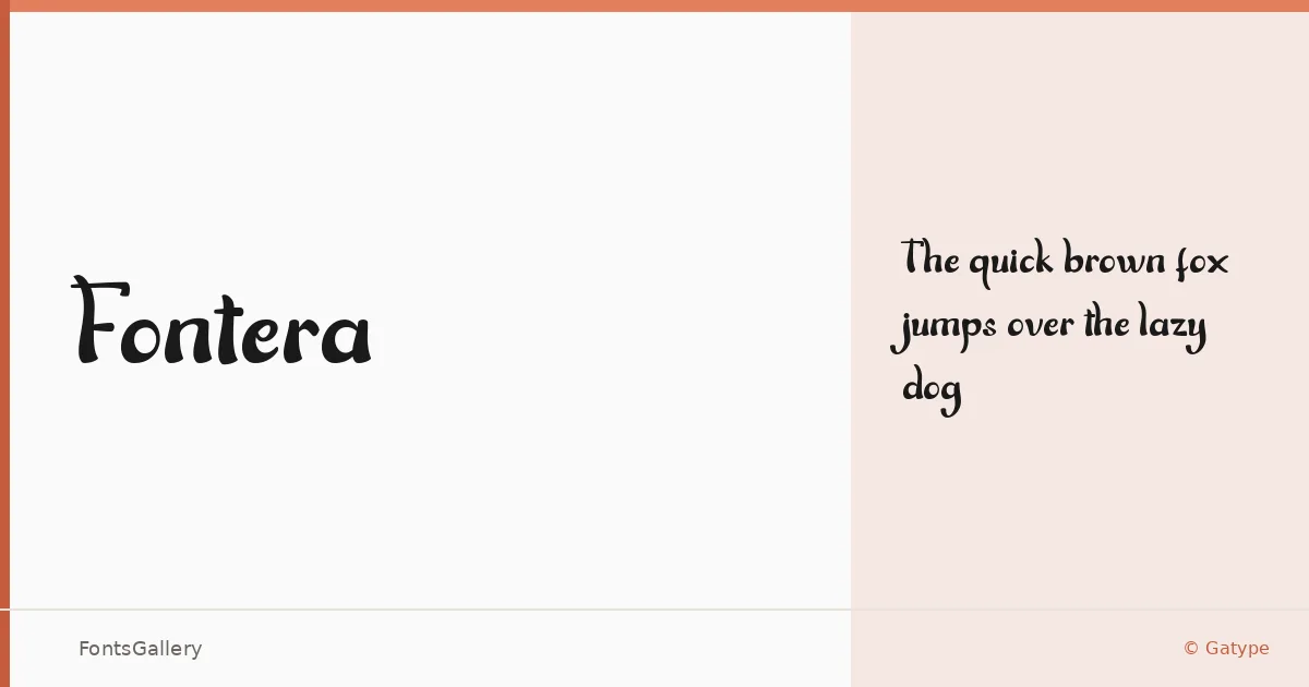
About Fontera Font
There's a roughness to the letterforms here — an intentional wear that sits somewhere between a hand-painted sign and a vintage pressed label. Designed by Khaidir for Gatype, this display face carries the kind of aged texture that feels earned rather than applied. It ships in a single cut: Regular.
Design Aesthetics & Character Characteristics
The family lands squarely in display territory, built for moments where rustic character and playful energy need to coexist. The vintage mood comes through in the uneven strokes and organic weight distribution — details that read clearly at headline scale but reward a closer look. Available as TTF and OTF, it covers Latin script in partial range, so check your character set before committing to a full alphabet.
Recommended Usage & Font Pairing
This one earns its keep on posters, branding work, logo lockups, and T-shirt graphics — anywhere a headline needs personality rather than polish. For body copy or secondary type, it pairs well with the clean structure of Helvetica or Asap, while Canela or Etna bring a softer editorial contrast, and AQUA can push the composition toward something more expressive.
License & Usage Terms
Fontera is released under Personal Use terms, which means commercial use is not permitted — confirm licensing with Gatype before applying it to client work or commercial projects. The font is embedded with installable permissions.