About FlatBread Font
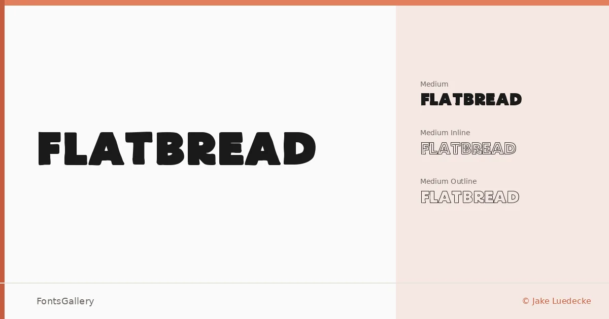
There is something immediately confident about these letterforms — a heaviness that sits between vintage signage and contemporary graphic design without committing entirely to either. Jake Luedecke built this display family around a single Medium weight, then pushed it in two additional directions: an Inline cut with an interior stroke that opens the forms up, and an Outline cut that strips them back to their skeleton.
Design Aesthetics & Character Characteristics
The three styles — Medium Inline, Medium, and Medium Outline — give you a layered toolkit rather than a simple progression from light to dark. The mood runs bold and modern while carrying just enough vintage character to read as crafted rather than generic. Used together, the Inline and Outline cuts can stack or overlap in ways that feel at home on a poster or a screen-printed tee. All three are delivered as TTF files.
Recommended Usage & Font Pairing
The family is built for situations where the type needs to carry weight on its own: headlines, logos, branding systems, and T-shirt graphics where a single word or short phrase has to land hard. The Outline style in particular earns its place on poster work, where it can hold a large point size without overwhelming the composition. For body copy or secondary text, the listed pairings span a wide range of tones — Bahnschrift and Helvetica for clean, neutral contrast; Canela or Etna for something with more editorial warmth; Times New Roman when you want the classical tension of a serif underneath.
License & Usage Terms
FlatBread is available under Personal Use terms, which means commercial use is not permitted — confirm licensing directly with the designer before using it in any client or revenue-generating work.