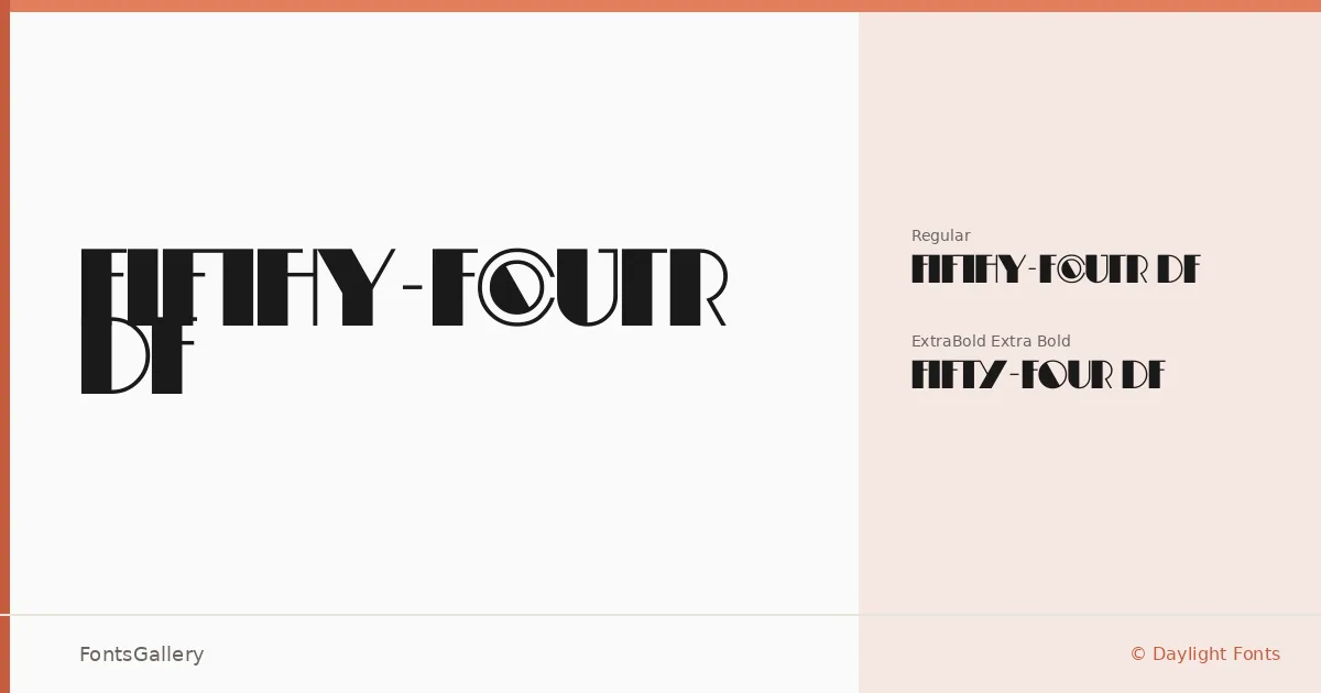
About Fifty-Four DF Font
There is something deliberate in the tension this display family holds — the kind of letterforms that feel both anchored in mid-century confidence and sharpened for contemporary use. Designed by Shin Oka for Daylight Fonts, it arrives in two cuts: Regular and ExtraBold. The range between them is narrow but purposeful, built for situations where weight is a statement of intention rather than a typographic afterthought.
Design Aesthetics & Character Characteristics
The family sits squarely in display territory, carrying a mood that is bold and modern while retaining something vintage in its proportions — an elegance that keeps it from reading as blunt. The Regular holds its own in refined headline contexts, while the ExtraBold pushes into territory suited to visual dominance. Both weights ship in TTF, WOFF, WOFF2, and OTF formats, covering the range of deployment environments you are likely to encounter. Latin script is supported throughout.
Recommended Usage & Font Pairing
This is a headline and logotype face first — it reads best when given room to work in posters, magazine covers, branding systems, and identity lockups where the type carries real visual weight. For body copy or supporting text, it pairs cleanly with Helvetica or Josefin Sans when you want to stay in a geometric, neutral register, and lifts considerably when set alongside Canela, ABC Arizona, or Asap for contrast between editorial warmth and structural precision.
License & Usage Terms
Fifty-Four DF is offered under Personal Use terms — commercial use is not permitted under this license, so confirm clearance with Daylight Fonts at www.daylightfonts.com before applying it to any client or commercial work. Embedding is permitted at an editable level.