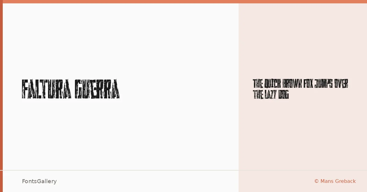
About Faltura Guerra Font
There is a roughness baked into every letterform here — edges that look worn, strokes that carry the texture of something hand-pressed or stamped rather than cleanly drawn. Måns Greback designed this display face with an unapologetically distressed character, leaning into grunge and vintage sensibility with conviction. The single Regular cut is TTF, covering the Latin script.
Design Aesthetics & Character Characteristics
This is a display face built for impact rather than extended reading — bold, rustic, and carrying the visual weight of old poster lettering or weathered signage. The forms feel raw and deliberate, the kind of type that reads immediately as having age and grit without trying to disguise the effect. One style, one weight, one clear intention: headline presence at any size.
Recommended Usage & Font Pairing
It earns its place on posters, band merchandise, T-shirt graphics, branding projects with a rugged or heritage edge, and logo work that needs texture and attitude rather than refinement. When you need to balance the rough character against something cleaner, it pairs well with Helvetica or Bahnschrift for a contrast of structured neutrality, or alongside Canela and ABC Arizona when a more editorial tone is called for. Etna offers a complementary display energy if two expressive faces suit the brief.
License & Usage Terms
Faltura Guerra is available under Personal Use terms only — confirm a commercial license before any client or revenue-generating work by contacting [email protected]. Embedding is permitted for preview and print only.