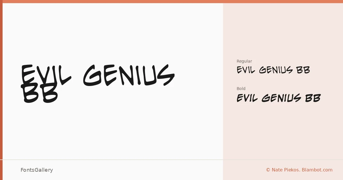
About Evil Genius BB Font
There is a roughened, theatrical energy to these letterforms — the kind that reads as both menacing and wry at the same time. Nate Piekos of Blambot.com designed this display family, and it carries the distinctive hand that has made his comic and genre lettering work recognizable. The two cuts, Regular and Bold, share that distressed, slightly unhinged character while giving you just enough control over weight.
Design Aesthetics & Character Characteristics
This is a grunge display face with a vintage streak and a genuinely playful edge — qualities that coexist more naturally here than you might expect. The Bold leans into drama; the Regular keeps things slightly more restrained without losing the attitude. Both are delivered as TTF files. In use, the letterforms have the handcrafted irregularity that works best when set large, where every roughed-up stroke can breathe.
Recommended Usage & Font Pairing
Headlines, posters, logo treatments, and T-shirt graphics are the natural territory — contexts where the grunge texture reads as intentional craft rather than noise. The contrast-heavy structure of Canela or the warm authority of Times New Roman can anchor body copy underneath it cleanly, while the rationalism of Helvetica or Bahnschrift makes for a sharp tonal counterpoint. Etna is worth considering when the brief calls for something with more edge throughout the composition.
License & Usage Terms
Evil Genius BB is offered under Personal Use terms — commercial use is not permitted under this license, so confirm clearance with Nate Piekos at blambot.com/license.shtml before taking it into a paid project.