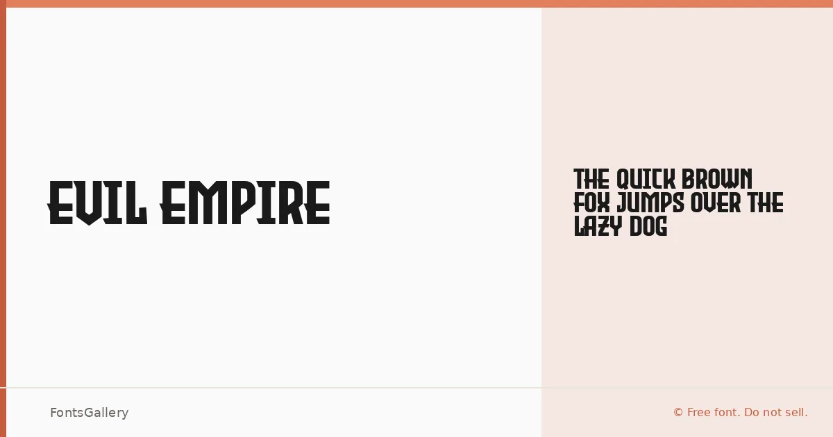
About Evil Empire Font
There is an unmistakable weight to these letters — the kind of compressed, slab-edged authority that pulls from vintage woodblock printing and grunge-era graphic design in equal measure. Tup Wanders built the face in FontCreator 11.5, and it arrives as a single Regular cut in OTF format, covering the Latin script. What it lacks in stylistic range it compensates for in sheer presence.
Design Aesthetics & Character Characteristics
This is a display face through and through — bold by nature, with a classic structure roughened just enough to feel worn and deliberate rather than clean. The mood sits at the intersection of vintage poster lettering and grunge-era graphic design: confident strokes, heavy optical mass, and just enough grit to keep it from feeling academic. A single Regular style means you work with its character rather than around it, and that constraint tends to focus a composition.
Recommended Usage & Font Pairing
It earns its place in headlines, branding lockups, poster titles, logo treatments, and T-shirt graphics — anywhere the typography needs to carry weight before a single word is read. For contrast pairings, it sits well alongside the elegance of Canela or the tight rationalism of Helvetica and Bahnschrift; for something with more drama, Etna or AQUA can match its energy without competing for the same visual register.
License & Usage Terms
Released under the SIL Open Font License, Version 1.1, with commercial use permitted and installable embedding allowed — note that the font itself may not be sold as a standalone file, so distribute it only as the license requires.