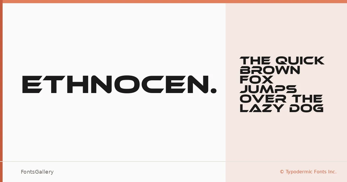
About Ethnocentric Font
There is a particular geometry to these letterforms — angular, compressed, built with the confidence of something meant to be read at scale. Raymond Larabie of Typodermic Fonts Inc. designed this display face with a futuristic edge that leans into bold structure without sacrificing legibility. The single Regular cut is delivered in OTF format, clean and ready to deploy.
Design Aesthetics & Character Characteristics
This is a display typeface that sits squarely in modern and futuristic territory, with a professional weight that keeps it from feeling like a novelty. The letterforms carry a mechanical tightness — angled cuts, strong verticals, minimal softness — that gives headlines and logotypes an authoritative presence. Despite having one style in the family, the design has enough inherent boldness to hold its own in demanding contexts. Language coverage extends across Latin, Vietnamese, Cyrillic, and Greek scripts, which broadens its reach considerably for international work.
Recommended Usage & Font Pairing
It earns its keep in branding systems, poster headlines, logo treatments, and T-shirt graphics where impact is the primary requirement — anywhere the type needs to project authority before a word is even read. For pairings, it works alongside clean neutrals like Helvetica or the more structured display voices of Aresink, Alexandria, Bizantheum, and Audex, each of which can serve as a counterweight or complement depending on the hierarchy you're building.
License & Usage Terms
Ethnocentric is available for commercial use under Typodermic Fonts Inc.'s terms, so it can be deployed in paid client work without reservation. Note that embedding is permitted for preview and print only, which is worth confirming against your production workflow if interactive or web embedding is required.