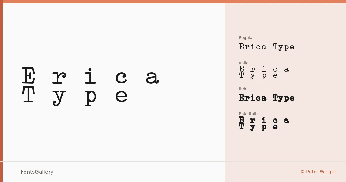
About Erica Type Font
There is something quietly familiar about this face — the measured, even spacing of a monospace design that carries the weight of typed correspondence and editorial tradition. Peter Wiegel drew it with a classic, professional character that sits somewhere between the warmth of vintage machinery and the composure of a structured grid. Every glyph earns its fixed width without feeling forced.
Design Aesthetics & Character Characteristics
Monospace designs live or die by their rhythm, and this one holds together across all four cuts: Regular, Italic, Bold, and Bold Italic. The mood is classic and professional with a vintage undercurrent — the kind of letterforms that read well under pressure, whether set tight on a business card or large on a poster. The TTF files are clean and install reliably, with embedding permissions set to installable.
Recommended Usage & Font Pairing
Branding work, magazine layouts, logo lockups, and poster headlines are where these forms find their footing — contexts where a structured, unhurried voice carries authority. Latin script is supported throughout. For contrast, the family pairs naturally with Helvetica or Asap for a neutral sans counterpoint, or with Canela, Etna, and ABC Arizona when a more editorial or contemporary feel is needed.
License & Usage Terms
Released under the SIL Open Font License alongside the GPL with font exception, both of which permit commercial use freely. The family is a trademark of Peter Wiegel.