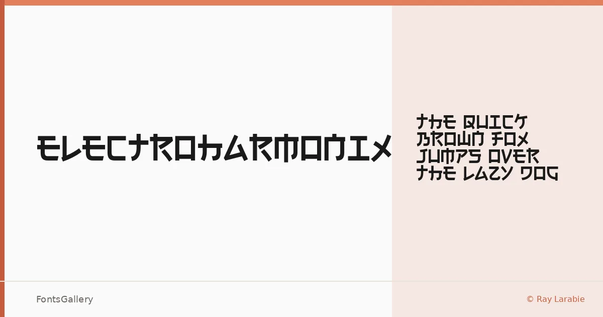
About Electroharmonix Font
There's a recognizable tension in this display face — letterforms that read as Latin but borrow the geometry of Japanese katakana, creating a kind of parallel-alphabet effect that stops the eye cold. It comes from Ray Larabie of Typodermic Fonts, a designer with a long history of pushing display type into unexpected structural territory. The single Regular cut ships as an OTF file, clean and ready to deploy.
Design Aesthetics & Character Characteristics
The mood here is futuristic and bold, with an edge of grunge that keeps it from feeling sterile — angular strokes carry real weight, and the forms feel like they belong on a piece of hardware or a concert stage rather than a corporate slide deck. As a display category face, it isn't built for running text; it earns its keep at large sizes where the structural oddness becomes the whole point. That single Regular style is enough, because the letterforms themselves do all the heavy lifting.
Recommended Usage & Font Pairing
It sits naturally in branding, poster, and logo work where a futuristic or modern energy is the brief — T-shirt design and headline use are equally strong fits, particularly for music, gaming, or tech-adjacent projects. The Latin coverage keeps it grounded in standard Western typesetting contexts. For contrast and readability alongside it, Helvetica brings neutral clarity, while Aresink, Alexandria, Bizantheum, and Audex each offer complementary character for more stylized pairings.
License & Usage Terms
Electroharmonix is released under the Creative Commons Zero (CC0) Public Domain Dedication — Raymond Larabie has waived all copyright and related rights to the fullest extent the law allows, which means commercial use is unrestricted and the font supports installable embedding with no further permissions required or expected.