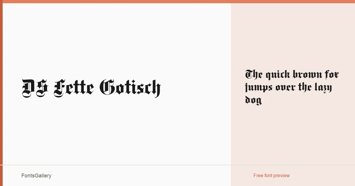
About DS Fette Gotisch Font
DS Fette Gotisch is a bold blackletter typeface designed by Dieter Steffmann and published through Typographer Mediengestaltung. Rooted in the rich tradition of Gothic script, it delivers a commanding presence that bridges classic heritage with contemporary design applications. Its weighty, expressive letterforms make it an instantly recognizable choice for projects demanding character and authority.
Design Aesthetics & Character Characteristics
True to its blackletter category, DS Fette Gotisch features the dense, angular strokes and dramatic thick-to-thin contrasts characteristic of traditional Gothic typefaces. Its vintage and classic qualities are reinforced through historically informed letterforms, while a bold, grunge-inflected edge gives it a raw, powerful energy. The result is a typeface that feels both timeless and strikingly impactful on the page.
Recommended Usage & Font Pairing
DS Fette Gotisch excels in high-impact design contexts such as logos, posters, branding identities, T-shirt designs, and certificates where a strong, authoritative tone is desired. Its bold personality pairs effectively with the clean neutrality of Helvetica for a striking contrast, or alongside Aresink for a complementary blend of styles. These pairings help balance its dramatic character while maintaining visual hierarchy and readability.
License & Usage Terms
DS Fette Gotisch is available for commercial use, making it suitable for a wide range of professional and commercial design projects. Always review the full license terms from the foundry directly to ensure compliance with any specific conditions of use.