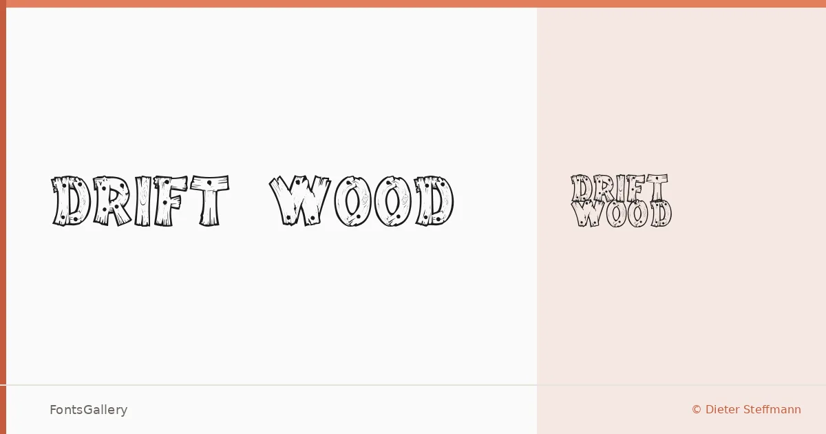
About Drift Wood Font
There is something deliberately weathered about these letterforms — each stroke carries the rough, hand-hewn texture of wood grain pressed into type. Designed by Dieter Steffmann under the Typographer Mediengestaltung copyright, the family arrives as a single Regular cut, which is all it needs. The character is concentrated, not spread thin across a weight range.
Design Aesthetics & Character Characteristics
This is a display face through and through — bold in presence, rustic in texture, and carrying a vintage whimsy that feels equally at home on an old general-store sign or a contemporary craft label. The TTF file delivers a single style, so the design relies entirely on its own visual weight rather than a range of cuts. Up close, the grain-like irregularities in each glyph are the point; they give the type its handmade, slightly unpredictable energy that clean digital faces cannot replicate.
Recommended Usage & Font Pairing
It earns its keep in branding, logo lockups, poster headlines, signage, and T-shirt design — anywhere a title needs to feel aged and hand-crafted rather than machine-precise. Latin character coverage is partial, so check your glyph set before committing to projects with accented or extended Latin requirements. For pairing, the structured neutrality of Helvetica or Bahnschrift balances the roughness nicely in body copy, while Canela brings an editorial softness for contrast; Etna and AQUA offer complementary display energy when layering headlines.
License & Usage Terms
Drift Wood is available for commercial use under its stated license, so branding and client work are covered — note, however, that embedding permissions are restricted, which may affect use inside PDFs or embedded digital documents.