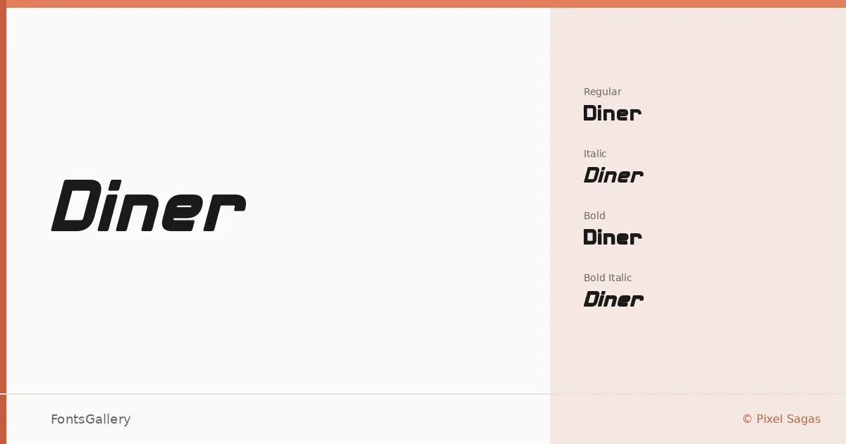
About Diner Font
There is something immediately familiar about this face — the thick strokes, the slightly worn edges, the sense that it belongs on a roadside sign or a diner window from another era. Designed by Neale Davidson of Pixel Sagas, it captures that mid-century American vernacular with enough sharpness to feel current rather than merely nostalgic. The letterforms carry real weight without losing their legibility at large sizes.
Design Aesthetics & Character Characteristics
This is a display family in four cuts — Regular, Regular Italic, Bold, and Bold Italic — available in OTF format. The mood sits at the intersection of vintage and modern, rustic in character but bold enough to anchor a composition on its own. The italic cuts lean with confidence, and the bold weights push hard without collapsing the forms. Latin coverage keeps the focus tight and the execution clean.
Recommended Usage & Font Pairing
It earns its place in branding work, poster headlines, signage, logo lockups, and apparel graphics — anywhere a strong, characterful display face needs to do the heavy lifting. Paired against the clean geometry of Helvetica or Bahnschrift, the contrast is sharp and purposeful. Set alongside Etna, Canela, or ABC Arizona, it takes on a more editorial or craft-market quality that works well across a range of brand voices.
License & Usage Terms
Diner is available under Personal Use terms, which means commercial use is not permitted — confirm licensing directly with Pixel Sagas before applying it to any commercial project. Embedding is set to editable.