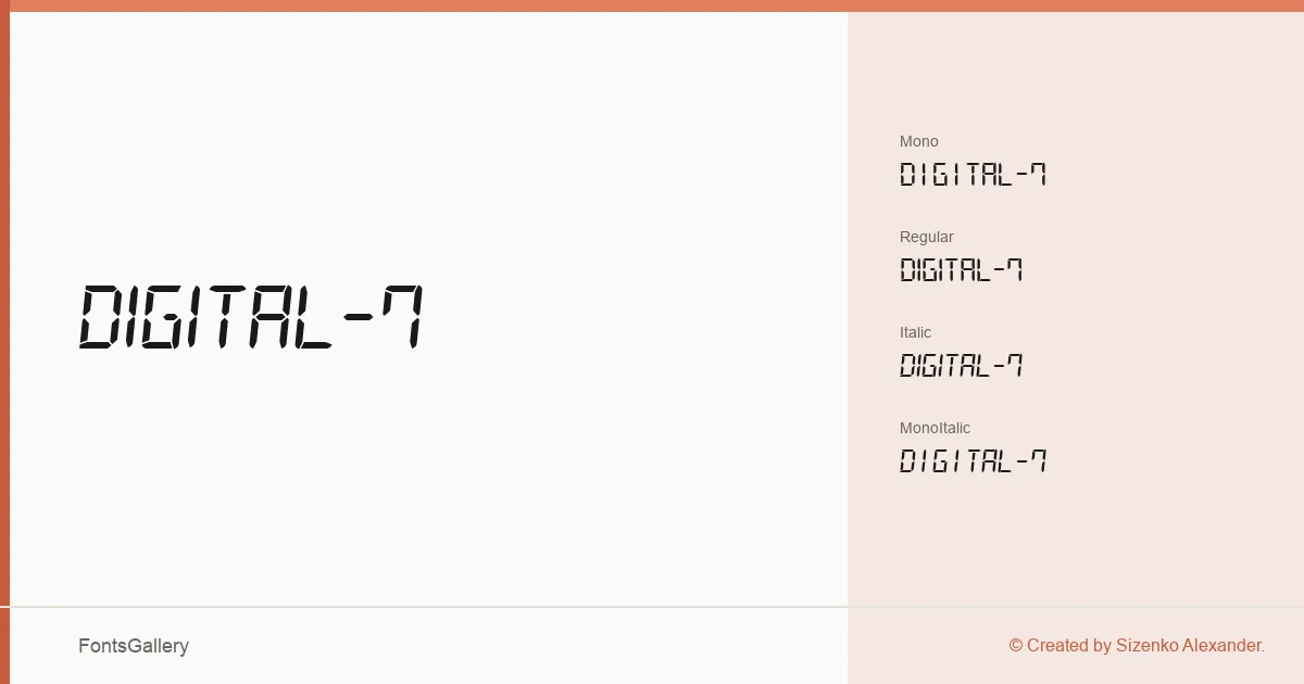
About Digital-7 Font
There is something immediately recognizable about the segmented geometry of a seven-segment display — that spare, grid-bound logic that reads as both retro and futuristic at once. Sizenko Alexander built this family around exactly that aesthetic, rendering the classic LED/LCD numeral form as a fully usable typeface. The letterforms are constructed from clean, uniform segments with no pretense of calligraphic warmth, which is precisely the point.
Design Aesthetics & Character Characteristics
This is a display family in the strictest sense — bold, modern, and unapologetically futuristic in tone. The family ships in TTF format across four cuts: Regular, Italic, Mono, and MonoItalic. The monospaced variants lock every character to a fixed advance width, which suits running counters or data readouts, while the proportional cuts give headlines and logotypes a little more natural spacing. Italics tilt the segments just enough to introduce momentum without breaking the digital illusion.
Recommended Usage & Font Pairing
It earns its place in signage, posters, branding that leans into technology or sci-fi references, and T-shirt design where a strong, readable silhouette matters more than subtlety. Advertisement work that needs an immediately legible, high-impact numeral sequence will find the Mono cuts especially useful. For contrast pairings, the family works alongside Helvetica, Aresink, Alexandria, Bizantheum, and Audex — each offering a more neutral or humanist counterweight to the mechanical rigidity of the segments.
License & Usage Terms
Digital-7 is released as freeware under Personal Use terms, meaning it is available for non-commercial projects only — confirm clearance directly with Sizenko Alexander at styleseven.com before deploying it in any commercial job.