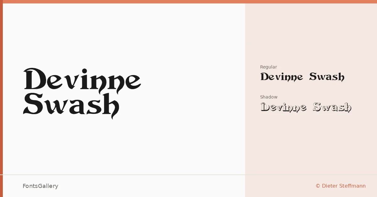
About Devinne Swash Font
There is a deliberate theatricality to these letterforms — the swashes curve with the confidence of a calligrapher who knows exactly when to stop. Designed by Dieter Steffmann and copyrighted by Typographer Mediengestaltung, the family draws from a classic display tradition where each capital carries decorative weight without collapsing into ornament.
Design Aesthetics & Character Characteristics
This is a display family in two cuts: the standard Regular and a Shadow variant that adds dimensional depth for when flat ink isn't quite enough. Both arrive as TTF files, and together they carry a vintage elegance that reads equally well at poster scale and in a compact logo lockup. The mood sits firmly in luxury and classic territory — think hand-lettered title pages, not stripped-back modernism. Latin character coverage keeps the focus tight and the execution clean.
Recommended Usage & Font Pairing
Book covers, headline treatments, branding identities, and posters are the natural territory here — anywhere a touch of period elegance needs to anchor the composition. The Shadow cut earns its place on dark-ground posters where dimensionality matters. For pairing, the swash energy contrasts well against the neutrality of Helvetica or Aileron, and it holds its own alongside more editorial choices like Canela, ABC Arizona, or Abrade.
License & Usage Terms
This family is available for commercial use, and embedding is permitted at the installable level, meaning you can embed it freely in documents distributed to others.