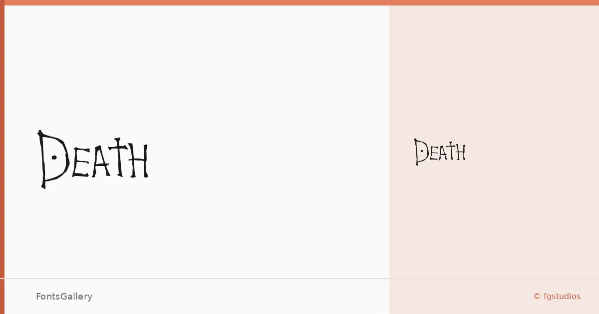
About Death Font
There is something deliberately weathered about the letterforms here — the kind of rough-edged, high-contrast treatment that feels pulled from an old broadside or a hand-worn woodblock. This is the work of fgstudios, and the single Regular cut delivers that grunge-meets-vintage character with enough whimsy in the details to keep it from reading as purely menacing.
Design Aesthetics & Character Characteristics
It sits firmly in the display category — bold by nature, not by weight slider, with an inherent roughness that gives it texture even at headline scale. The family ships in a single Regular style as a TTF file, so what you see is what you get: one strong, considered voice with no interpolated range to dilute it. The forms carry that push-and-pull between grunge decay and a certain theatrical wit, which is exactly what makes them interesting to work with rather than merely aggressive.
Recommended Usage & Font Pairing
It earns its place on book covers, posters, and T-shirt graphics where the worn, expressive quality reads as intentional craft rather than accident. Branding and logo work are viable when the client's identity has room for something raw and characterful. For body copy or supporting text, pair it against something clean and controlled — Helvetica or Asap hold the line without competing, while Canela, ABC Arizona, or Etna each bring their own editorial warmth that can complement the rougher energy at display size.
License & Usage Terms
Released under the Creative Commons Attribution-NoDerivs (CC BY-ND) license, which allows commercial use — attribution is required and derivative works are not permitted, so use the face as-is and credit fgstudios accordingly.