About Dealer Strikes Font
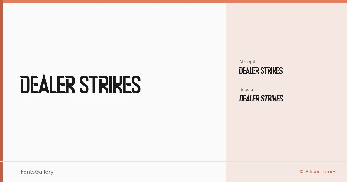
There is a roughness to these letterforms that feels deliberate — a controlled deterioration, like type pulled from an old screen print or stamped through an inked stencil. Allison James at Chequered Ink built the family in two cuts: Dealer Strikes Regular, with its characteristic organic edges, and Dealer Strikes Straight, a companion that reins in the irregularity while keeping the same underlying structure.
Design Aesthetics & Character Characteristics
This is a display family that lives in the tension between grunge and modern confidence — bold enough to anchor a composition, with enough vintage wear to suggest something hand-made rather than algorithmic. The two OTF styles give you a choice of how much texture you want to carry: the Regular leans into the grit, while the Straight variant sits closer to clean geometry without abandoning the family's raw character. Both are drawn for impact at large sizes.
Recommended Usage & Font Pairing
The weight and attitude here suit headline work, poster layouts, logo lockups, branding with an edge, and T-shirt graphics where the letterforms need to hold their own against bold imagery. For contrast, the named pairings worth considering are Helvetica, Canela, Abrade, ABC Arizona, and Aileron — each offering a cleanness that lets this family's rougher qualities read as intentional rather than unfinished.
License & Usage Terms
Dealer Strikes is available under Personal Use terms, which means commercial use is not covered — confirm licensing directly with Chequered Ink before placing it in any client or commercial work. Embedding is permitted at the installable level.