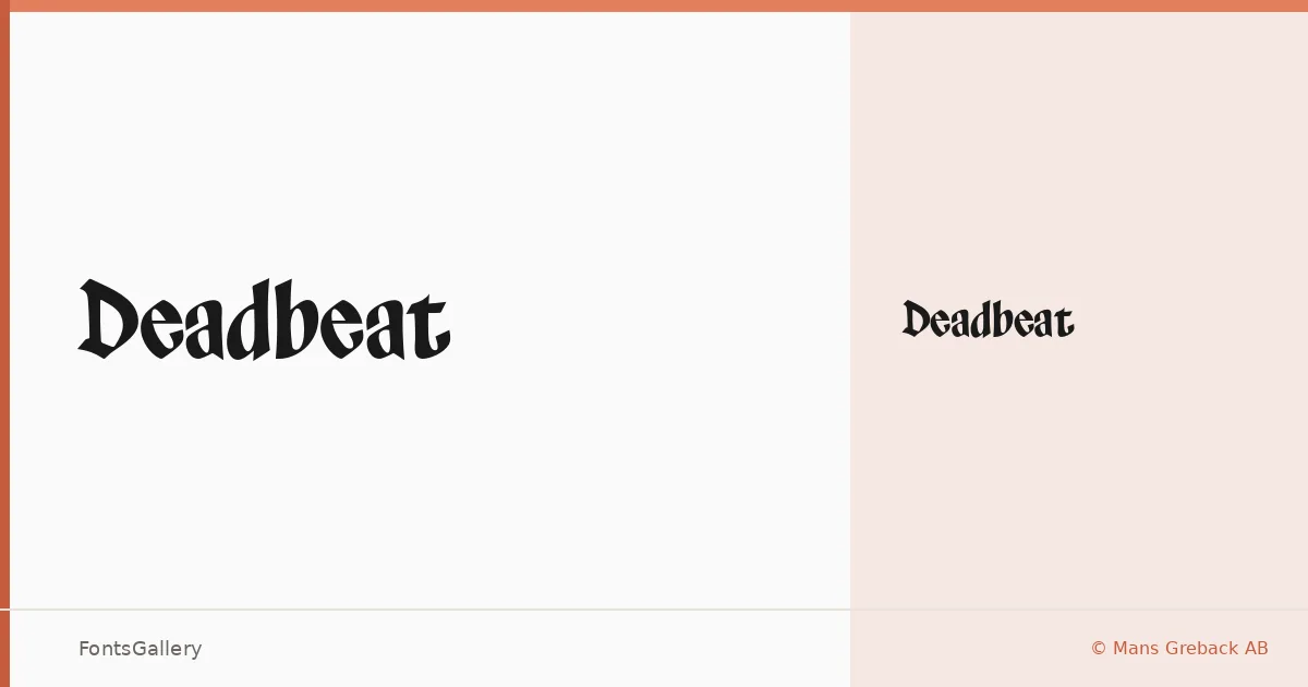
About Deadbeat Font
There is a rawness to this blackletter that separates it from the purely decorative end of the genre — the strokes carry weight without tipping into ceremony, and the overall texture reads as grunge-inflected rather than strictly historical. It is the work of Mans Greback, released under Mans Greback AB, and it arrives as a single Regular cut in OTF format.
Design Aesthetics & Character Characteristics
The family sits squarely in blackletter territory but pulls toward a bold, vintage character that feels closer to a worn broadside or a band T-shirt than to a medieval manuscript. The letterforms have a classic underlying structure kept rough at the edges, which gives them presence without rigidity. Latin and Latin Extended (partial) character sets are included, along with Vietnamese, so the coverage extends meaningfully beyond basic Western European text.
Recommended Usage & Font Pairing
The weight and attitude make it well suited to posters, magazine headers, branding marks, logos, and T-shirt design — anything that calls for a headline with attitude rather than a text face built for reading. It pairs well with the contrasting cleanliness of Helvetica or Bahnschrift, and holds up alongside the warmer editorial character of Canela, Etna, or ABC Arizona, depending on how much tension you want in the layout.
License & Usage Terms
This family is available under personal-use terms only — confirm before any commercial job by obtaining a commercial license at www.mansgreback.com. Embedding is restricted under the current license.