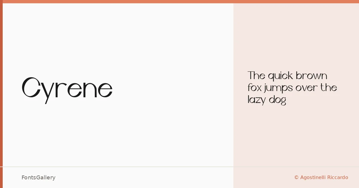
About Cyrene Font
There is a particular kind of restraint in this display face — the kind that takes more discipline to achieve than ornament ever does. Designed by Agostinelli Riccardo, it arrives as a single Regular weight in OTF format, built around a minimal, modern sensibility that keeps every letterform lean and intentional.
Design Aesthetics & Character Characteristics
Cyrene sits squarely in the display category, carrying an elegance that comes from what is left out rather than what is added. The forms feel composed and unhurried, with the kind of measured spacing and clean geometry that reads as confident in large settings. Partial Latin coverage means it handles the essentials of Western European text without reaching further.
Recommended Usage & Font Pairing
Its natural territory is anywhere a headline needs to carry presence without noise — poster work, magazine headers, logo lockups, and website headers where the type itself does the heavy lifting. For body copy or secondary text, it sits well alongside Helvetica or Aileron for a clean editorial contrast, while Aranea, Aresink, and Alexandria each offer different tonal registers depending on how much warmth or structure the layout needs.
License & Usage Terms
The family is available for commercial use under a copyright-free license, with installable embedding permitted, so it can move freely between design environments and client deliverables.