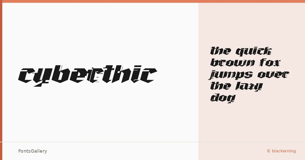
About Cyberthic Font
There is something deliberately unresolved about this blackletter — the gothic weight of the strokes carries a raw, almost mechanical edge that sits at odds with the ornate traditions the style usually evokes. It comes from blackerning, a font studio run by Taufiqurrohman Nadri, and that tension between old-world structure and something harder and more industrial is clearly intentional. The single cut available is Regular, offered in OTF format.
Design Aesthetics & Character Characteristics
The mood lands somewhere between grunge and futuristic, which is a genuinely unusual place for a blackletter to occupy — vintage in its bones but with a boldness that pushes it toward contemporary, abrasive territory. The letterforms feel heavy and deliberate, built for settings where presence matters more than subtlety. Latin coverage is partial, so it handles the essentials without reaching into extended character sets.
Recommended Usage & Font Pairing
This is a headline and display face through and through — posters, logos, branding work, and T-shirt graphics are where the weight and character read best rather than being lost in running text. When you need to soften the confrontational quality of the blackletter forms, pairing it with something clean and structurally neutral like Helvetica creates useful contrast; for something with more personality in the companion, Canela, ABC Arizona, Abrade, or (AH) Manal each offer distinct counterpoints worth exploring.
License & Usage Terms
This family is distributed under a Demo license — commercial use is not permitted under these terms, so confirm licensing directly at the vendor page before taking it into any paid project.