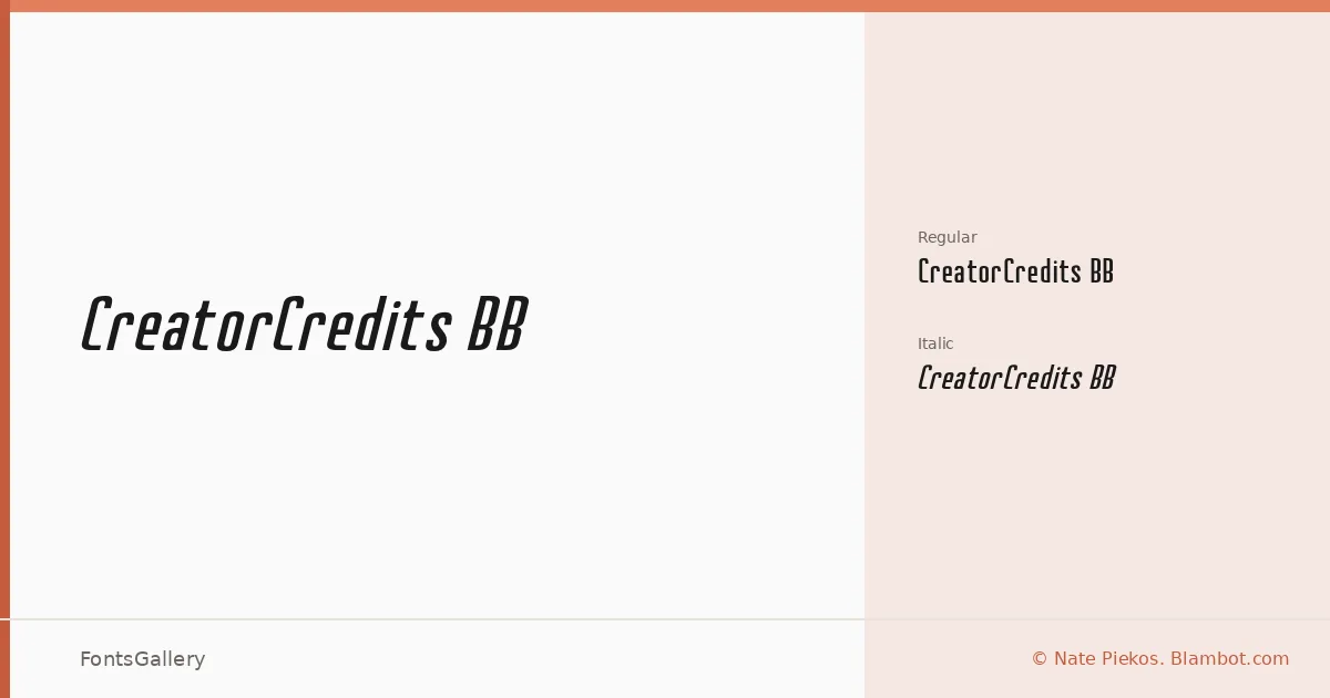
About CreatorCredits BB Font
There is a deliberate authority to these letterforms — the kind of confident, slightly compressed energy you see in broadcast title cards and editorial headers. Nate Piekos of Blambot designed this display face, and it carries the precise, purposeful construction that his studio is known for. The family ships in OTF format with two cuts: Regular and Regular Italic.
Design Aesthetics & Character Characteristics
This is a display family in the modern, bold tradition — the sort of type that holds its ground at large sizes without shouting. The upright cut has a clean, professional posture, while the italic introduces just enough forward lean to give headlines and bylines a sense of motion. Both weights read with the kind of finish that suits branding work where authority matters.
Recommended Usage & Font Pairing
The forms are built for high-visibility applications: poster headlines, logo lockups, and T-shirt graphics where the type needs to carry weight on its own. It pairs well alongside Helvetica or Aileron when you need a neutral grotesque to handle body text, and it holds its own next to more editorial companions like Canela or ABC Arizona when contrast is the goal. Abrade and Canela in particular offer interesting tonal counterpoints in branding contexts.
License & Usage Terms
This family is available under Personal Use terms only — confirm licensing directly with Nate Piekos at blambot.com/license.shtml before committing it to any commercial job. Embedding is limited to preview and print only.