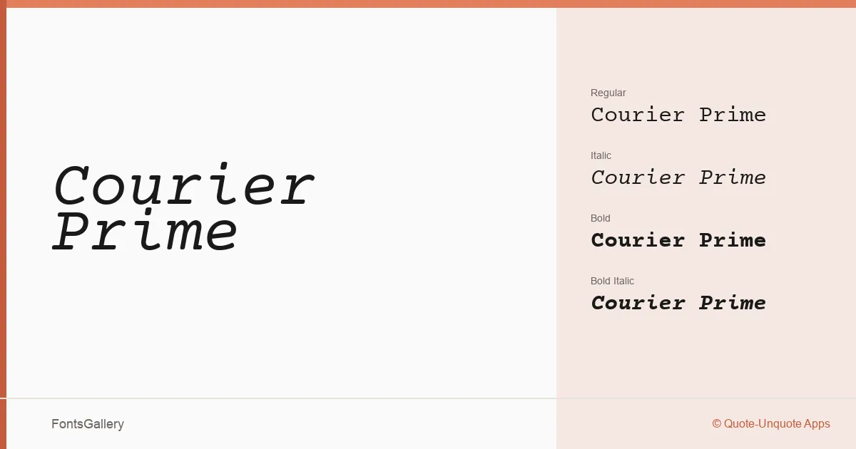
About Courier Prime Font
There is something immediately recognizable about a well-drawn monospace — the insistence of equal spacing, the faint echo of the typewriter. Alan Dague-Greene of Quote-Unquote Apps brought a considered hand to this one, refining the classic courier form into something that reads cleanly at small sizes without losing the vintage character that makes the genre worth revisiting. The letterforms carry just enough ink in the strokes to feel substantial rather than skeletal.
Design Aesthetics & Character Characteristics
This is a monospace family with a classic, professional temperament — minimal enough for data-heavy contexts, yet carrying a vintage warmth that keeps it from feeling cold. The family ships in TTF format across four cuts: Regular, Italic, Bold, and Bold Italic. That range is modest but complete, giving you upright and angled voices at two weights, which is genuinely enough for most editorial and document work. The fixed-pitch rhythm reads as disciplined rather than mechanical.
Recommended Usage & Font Pairing
The even cadence of a monospace makes it well-suited to contexts where deliberateness matters — branding systems, business cards, posters, and presentation decks where the typewriter register adds authority rather than nostalgia. Magazine layouts that want to signal editorial precision will also find it useful. Latin script is covered throughout. It pairs naturally with the neutral geometry of Helvetica, and sits comfortably alongside Aresink, Alexandria, Bizantheum, and Audex when contrast between mono and proportional voices is what the layout needs.
License & Usage Terms
Courier Prime is released under the SIL Open Font License, which permits commercial use, embedding, modification, and redistribution — the one condition being that the font itself cannot be sold as a standalone product and that any derivative must retain the same license.