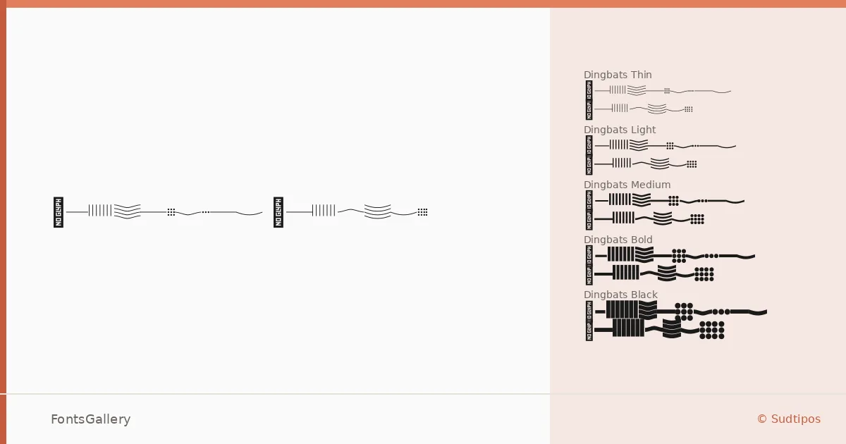
About Confiteria Dingbats Font
There is a particular kind of restraint in the way these letterforms carry their ornament — decorative without tipping into excess, romantic without losing their composure. Julieta Ulanovsky and Sol Matas, working under the Sudtipos banner, built this family as two parallel series: a script and a companion dingbats set, each running the same nine weights from Thin through Black. The result is a system rather than a single face, designed so that the flourishes and the letterforms can breathe together.
Design Aesthetics & Character Characteristics
The family sits in decorative territory with an unmistakably vintage and romantic sensibility — the kind of mood that suits wrapping paper, wax seals, and monogram marks as naturally as it suits a headline. Both the Script and Dingbats series span Thin through Black in OTF format, giving you precise control over weight without ever abandoning the whimsical elegance at the core of the design. The dingbats collection is the less common part of the equation: having ornamental elements that share the exact proportional logic and weight range of the script means they sit beside each other without any of the usual friction.
Recommended Usage & Font Pairing
The natural territory here is work that needs a ceremonial register — wedding stationery, invitation cards, certificates, and branding projects where a handcrafted, elegant tone is deliberate rather than decorative afterthought. Latin script coverage serves all the expected European-language jobs in those contexts. For contrast, the clean geometry of Helvetica or Bahnschrift keeps the script from getting too heavy in mixed layouts, while Canela's editorial warmth and the character of Etna or AQUA offer softer, more tonally aligned companions.
License & Usage Terms
This family is released under a Personal Use license, which means commercial use is not permitted under these terms — confirm the appropriate licensing directly with Sudtipos before applying it to any client or commercial work.