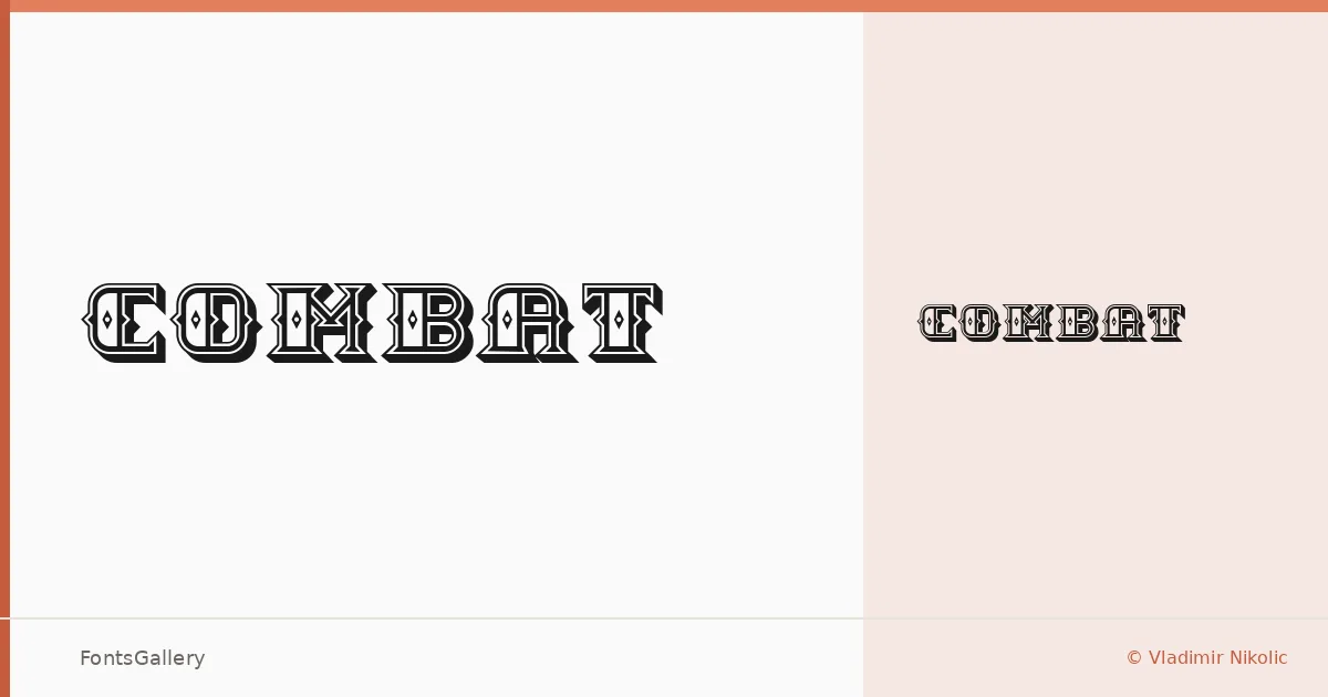
About Combat Font
There is a roughness to these letterforms — an intentional wear in the strokes that reads immediately as grunge without tipping into illegibility. The family was designed by Vladimir Nikolic and consists of two cuts: Combat Regular and Combat Hollow Regular, the latter opening the interior of each glyph for a stencil-like effect that adds another layer of attitude.
Design Aesthetics & Character Characteristics
This is a display family built for impact — bold, vintage in spirit, and carrying a classic heaviness that suits work meant to command attention at large sizes. The Regular cut presses full and dark onto the page, while the Hollow Regular pulls back the fill to expose negative space inside each letter, giving designers a second expressive register within the same stylistic world. Both are delivered as TTF files. The overall mood sits somewhere between old military stenciling and worn screen-print graphics.
Recommended Usage & Font Pairing
The obvious homes for this family are headlines, posters, logos, and branding that leans into a raw, hand-worn aesthetic — it is also well suited to T-shirt design, where that grunge character tends to read exceptionally well at a distance. For contrast pairings, the clean geometry of Helvetica or Asap works well against its roughness, while Canela, Etna, and ABC Arizona each offer a more editorial tension. For body copy, Asap's neutrality in particular gives the combination breathing room.
License & Usage Terms
This family is distributed under Personal Use terms — commercial use is not permitted, so confirm licensing with Vladimir Nikolic before deploying it in any paid or client-facing work. Embedding is limited to preview and print only.