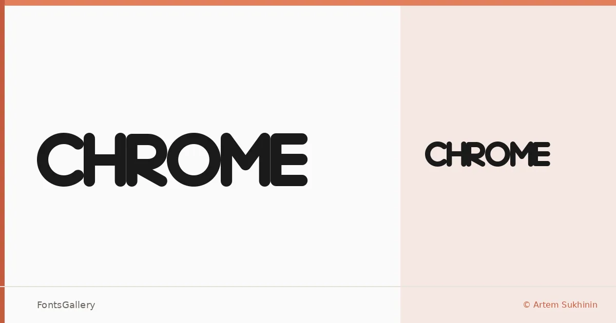
About Chrome Font
There is a particular tension in these letterforms — hard edges holding just enough curve to feel mechanical rather than geometric. Designed by Artem Sukhinin, the family arrives in two cuts: Chrome Normal Regular and Chrome Black Normal Regular, the latter pressing into display weight with considerably more presence.
Design Aesthetics & Character Characteristics
The category is display, and the forms lean into it fully — futuristic in attitude, modern in their sharpness, bold in intent even at the lighter setting. Both styles are delivered as TTF files. The Black weight is where the design really commits: strokes thicken to the point where negative space becomes part of the composition, making individual characters read almost as objects.
Recommended Usage & Font Pairing
The natural habitat here is anywhere a headline needs to carry visual authority on its own — posters, logos, branding systems, and the kind of T-shirt graphics where the type does most of the work. For text companions, it sits well alongside the clean rationalism of Helvetica or Bahnschrift, and the contrast sharpens further when paired against the editorial warmth of Canela or the classical structure of Times New Roman. Etna is worth considering when you want something that matches the energy without undercutting it.
License & Usage Terms
This family is available for commercial use. Embedding is permitted for preview and print only, so confirm those constraints suit your production workflow before deploying in interactive or installable documents.