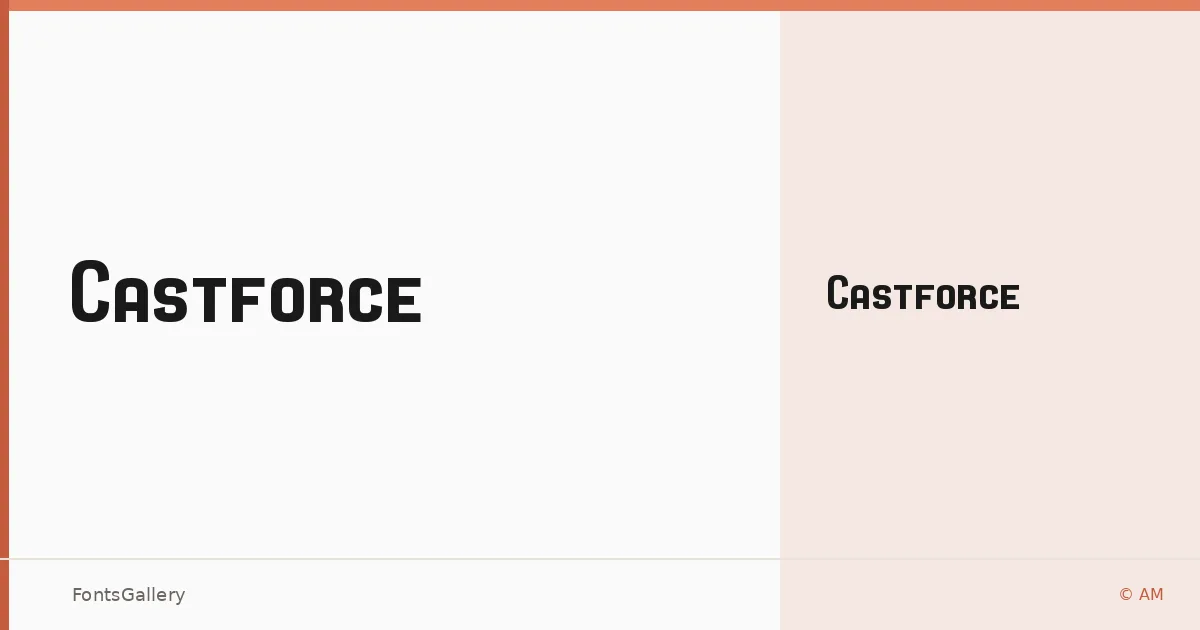
About Castforce Font
There is a certain engineered confidence to these letterforms — angular, deliberate, and built for impact. Castforce comes from AM at Chequered Ink and arrives as a single Regular weight in OTF format. The construction reads as mechanical and forward-leaning, the kind of type that suggests velocity even when it is standing still.
Design Aesthetics & Character Characteristics
This is a display face with a futuristic and modern edge, sitting comfortably in bold, professional territory. The single Regular cut is uncompromising — there are no lighter options to soften the mood, which keeps the character of the design focused and intentional. At large sizes, the geometry of each glyph reads clearly; the forms reward headlines and logotype work more than they reward continuous text.
Recommended Usage & Font Pairing
The natural home for this family is anywhere scale and presence matter: posters, brand marks, logo lockups, and t-shirt graphics. For contrast in layouts, it pairs well against the rational geometry of Bahnschrift or Helvetica, the editorial softness of Canela, the structured warmth of Etna, or the classical authority of Times New Roman — each offers a different kind of relief against the weight this face carries.
License & Usage Terms
Castforce is released under a Donationware license, which does not allow commercial use — confirm terms at chequered.ink/font-license/ before applying it to any paid work. Embedding is permitted at the editable level.