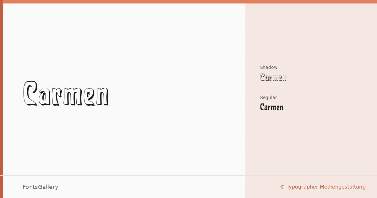
About Carmen Font
There is a deliberate weight to these letterforms — a hand-pressed, ink-soaked quality that recalls trade cards and marquee lettering more than anything drawn on a screen. The family was created by Typographer Mediengestaltung and comes in two cuts: Carmen Regular and Carmen Shadow, the latter adding a dimensional drop that pushes the vintage character even further.
Design Aesthetics & Character Characteristics
This is a display face built for impact at large sizes, and its mood sits squarely in classic and rustic territory — the kind of letterforms that feel at home on a weathered storefront or a limited-edition label. The Shadow style is not a throwaway alternate; it gives designers a ready-made layer of depth without reaching for an extra effect in the application. Both cuts are delivered as TTF files with installable embedding permissions, and Latin coverage handles the expected range of Western European copy.
Recommended Usage & Font Pairing
The natural territory here is branding, logo lockups, poster headlines, signage, and t-shirt graphics — anywhere the goal is a strong, characterful statement at display scale. For body copy or supporting text, the clean geometry of Bahnschrift or Helvetica makes a composed contrast, while Canela or Times New Roman can introduce a more editorial tension. Etna is worth considering if you want to keep the vintage register consistent across a layout.
License & Usage Terms
The family is available for commercial use, so branding and client work are straightforwardly covered under the stated license terms.