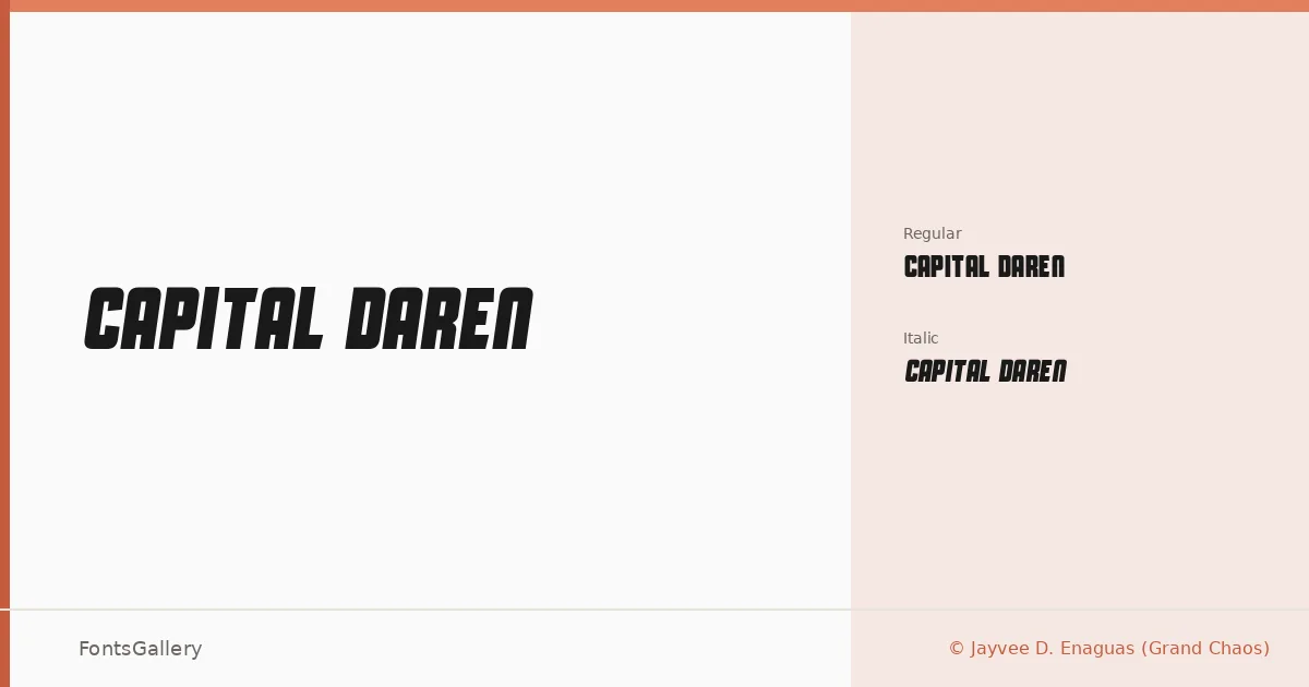
About Capital Daren Font
There is something deliberately geometric about the letterforms here — angular, tightly constructed, and carrying a futuristic edge that reads as modern without feeling throwaway. This display family was designed by Jayvee D. Enaguas of Grand Chaos and comes in two cuts: Regular Regular and Regular Italic, both delivered as TTF files.
Design Aesthetics & Character Characteristics
The family sits squarely in the display category, built for moments where a headline needs presence and a professional sharpness. Its bold, futuristic character makes the upright weight feel almost architectural, while the italic introduces just enough lean to give motion to the same clean structure. Latin character coverage keeps the focus tight and the rendering consistent across that script.
Recommended Usage & Font Pairing
The two weights work well wherever type needs to carry visual weight fast — posters, signage, logos, and T-shirt graphics are natural territory, and the faces hold up at headline scale without softening into something generic. For body or supporting text, the listed pairing families Etna, Canela, Helvetica, ABC Arizona, and Bahnschrift each offer a different tonal counterweight, from the warmth of Canela to the utilitarian steadiness of Bahnschrift and Helvetica.
License & Usage Terms
Capital Daren is released under Personal Use terms — commercial use is not permitted, so confirm clearance before taking it into any client or revenue-generating work. The license follows a Creative Commons Attribution-NonCommercial-ShareAlike 3.0 framework, and embedding is set to editable.