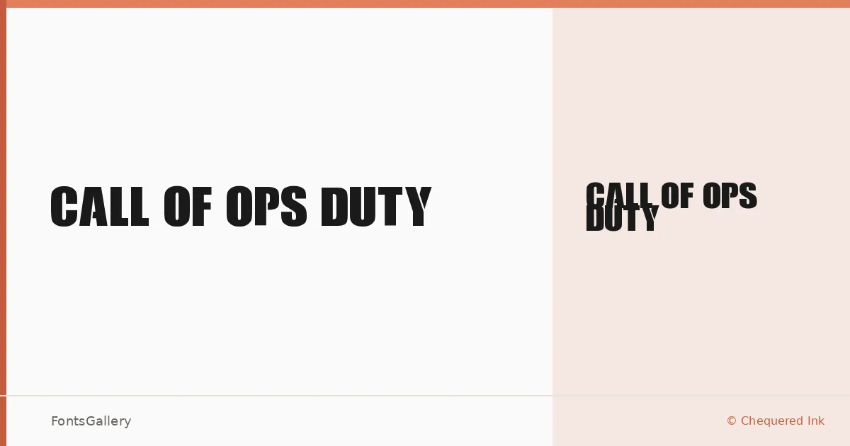
About Call Of Ops Duty Font
There is a particular kind of weight in military-themed display lettering — the kind that feels stenciled, worn, and deliberately aggressive — and this face delivers exactly that. Created by Chequered Ink, with a copyright held by NALGames, it carries a grunge-inflected, vintage character that suits content with an edge. The single Regular cut is available as an OTF file, built to hold its ground at large sizes.
Design Aesthetics & Character Characteristics
The letterforms sit squarely in the display category, carrying a bold, professional authority balanced against a grunge texture that stops it feeling corporate. The rough edges and commanding proportions give it a vintage quality without looking dated — it reads as intentional rather than worn out. Latin character coverage keeps the scope focused, and the editable embedding permission means it travels well inside documents and layouts.
Recommended Usage & Font Pairing
This face earns its keep in headline settings, poster work, logo treatments, branding campaigns, and T-shirt design — anywhere the visual tone needs to feel direct and forceful. For text companions, it has been tested alongside Bahnschrift, Helvetica, Canela, Etna, and Times New Roman, giving you a range of choices from clean geometric sans-serifs to classical serifs depending on how much contrast you want to build into the layout.
License & Usage Terms
This family is available for commercial use, so it can be deployed in paid client work without restriction under its current terms. Embedding is permitted at an editable level.