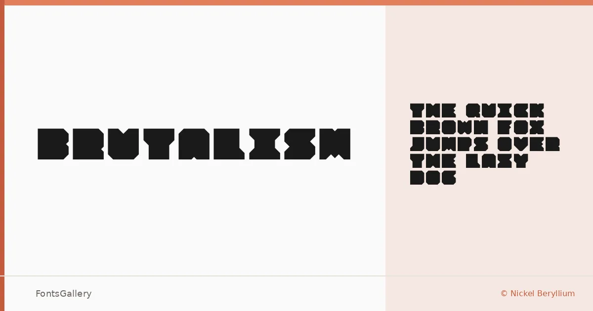
About Brutalism Font
There is nothing soft here. Designed by Nickel Beryllium, this display face leads with raw weight and a deliberate roughness — the kind of letterforms that feel like they were cut rather than drawn. The single Regular weight is delivered as an OTF, built for moments that need impact rather than nuance.
Design Aesthetics & Character Characteristics
The character sits at an interesting crossroads: grunge texture and modern bluntness pulling against a vintage sensibility that keeps it from feeling purely contemporary. It is a display face in the truest sense — it does not compromise its personality to fit comfortably in a paragraph. Bold by nature, it commands the space it occupies and makes no apology for that.
Recommended Usage & Font Pairing
This is a face for headlines, posters, logos, and branding work where the type itself needs to carry attitude — including apparel graphics and T-shirt designs where grunge and modern-vintage tension read well at large scale. Latin coverage is partial, so verify that your specific character needs are met before committing. It pairs well with the clean neutrality of Helvetica or with display companions like Aresink, Alexandria, Bizantheum, and Audex when you need contrast or harmony within a layout.
License & Usage Terms
Released under a Personal Use license — free for personal use, but commercial use is not permitted under these terms, so confirm licensing with the designer before any paid or client work.