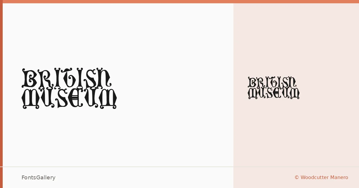
About British Museum Font
There is a particular weight to this blackletter — the kind that feels pulled from a broadside or a medieval manuscript cover, then roughed up just enough to sit comfortably in contemporary work. It comes from Woodcutter Manero, whose studio has built a substantial catalog of display faces with strong historical references and an equally strong street sensibility. A single Regular cut is available in TTF format.
Design Aesthetics & Character Characteristics
This is a blackletter with a grunge edge: the strokes carry the classic gothic structure — compressed verticals, angled terminals, the characteristic density of the form — but the texture reads vintage rather than pristine. That combination of bold and classic with an underlying roughness gives the letterforms a raw authority that works well at large sizes. The Latin character set keeps the scope focused and the rendering intentional.
Recommended Usage & Font Pairing
Think editorial headlines, album branding, poster type, T-shirt graphics, and logo lockups where gravitas and grit need to coexist. At display scale it holds its ground in magazine contexts too, particularly against clean sans-serifs. For contrast pairings, the listed companions — Etna, Canela, Helvetica, ABC Arizona, and Bahnschrift — each offer different degrees of neutrality or warmth to balance the blackletter's density.
License & Usage Terms
British Museum is issued under Personal Use terms only, meaning commercial use is not permitted — confirm licensing directly with Woodcutter Manero at [email protected] or via woodcutter.es before taking it into any paying job.