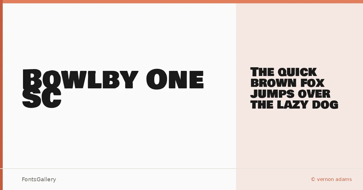
About Bowlby One SC Font
There is a particular confidence to these letterforms — wide, bold, and built entirely in small caps, with strokes that carry real weight without tipping into aggression. Vernon Adams designed this single-cut display face, and the choice to commit fully to the small-cap form gives it a consistency that upright mixed-case alphabets rarely achieve.
Design Aesthetics & Character Characteristics
This is a display face in the modern, bold tradition — the kind of type that holds a headline at large sizes without needing ornament to do it. The family ships as a single Regular weight in TTF format, which is honest: one cut, one purpose, done well. The uniform cap height and generous bowl proportions make it feel grounded and professional, the sort of letterform that reads with authority at a distance.
Recommended Usage & Font Pairing
It earns its keep in branding, advertising, poster work, and logo lockups — anywhere a headline needs to land without equivocation. Latin-language projects are the natural home here. For body copy or secondary text, it sits well alongside Helvetica for a clean modern contrast, or with Aresink, Alexandria, Bizantheum, and Audex when the project calls for something with more character underneath it.
License & Usage Terms
Released under the SIL Open Font License, which permits commercial use openly — you can find the full terms at scripts.sil.org/OFL. Embedding is installable, so the font travels cleanly inside documents and applications.