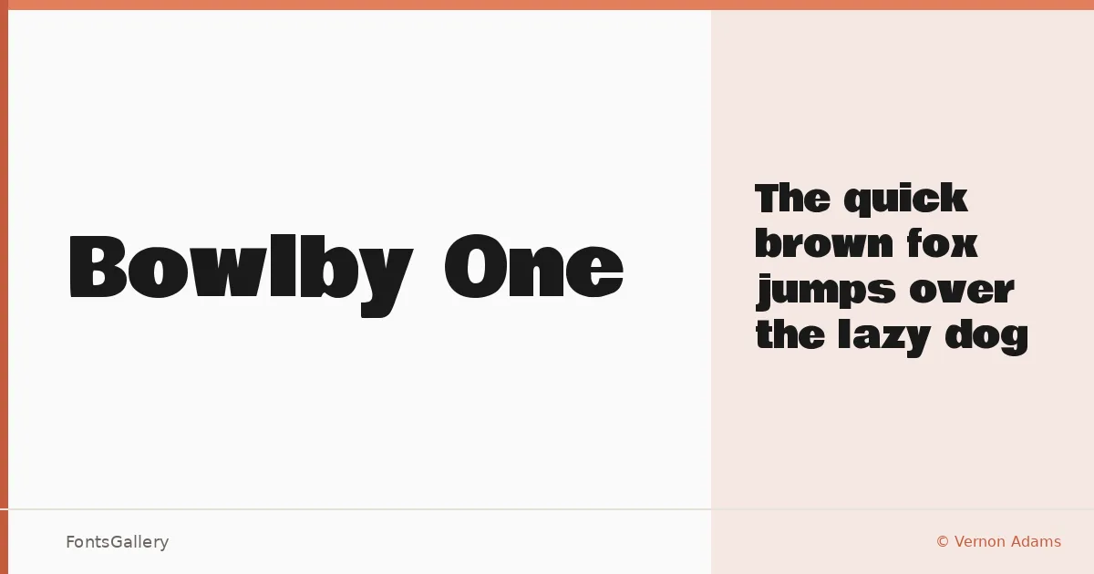
About Bowlby One Font
There is something unapologetically heavy about this display face — the bowls are generous, the strokes push right up to the edge of what a single weight can carry, and the whole thing lands with real authority on a page. Vernon Adams of Vernon Adams designed it, and the name on each reserved glyph tells you he treated it as a proper piece of work rather than a quick release. Coverage is Latin.
Design Aesthetics & Character Characteristics
This is a display typeface with a modern, professional confidence — broad, bold forms that were built for scale. The family ships as a single cut, Regular, delivered as a TTF, which means it is a tool for a specific job rather than a workhorse system. At large sizes the letterforms hold together cleanly: no excessive contrast, no fussiness in the terminals, just a sturdy constructed weight that reads from a distance.
Recommended Usage & Font Pairing
It earns its keep in headlines, posters, branding, logos, and advertising — anywhere the type needs to announce itself before the reader even decides to read. Because there is only one style, body copy will need a companion, and the face pairs well alongside Helvetica, Aresink, Alexandria, Bizantheum, and Audex, each of which offers enough neutrality or contrast to let the display work do its job without competing.
License & Usage Terms
Released under the SIL Open Font License, Version 1.1, which permits commercial use and installable embedding. The font names "Bowlby," "Bowlby One," and "Bowlby One SC" are reserved under the terms of that license.