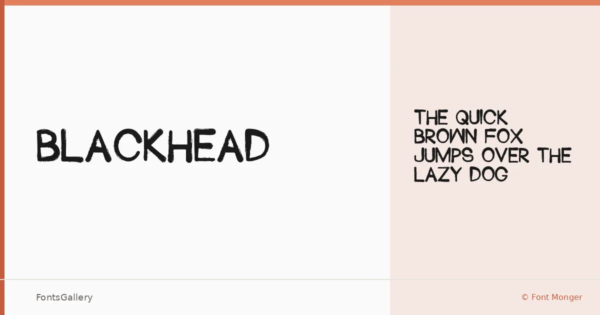
About Blackhead Font
There is a rawness to this display face that announces itself immediately — thick strokes carrying a grunge-inflected energy, letterforms that feel like they belong on a wall poster rather than a corporate memo. Chris Vile designed it under the Font Monger label, and the result is a single-weight display cut with genuine character, available in both TTF and OTF formats.
Design Aesthetics & Character Characteristics
Blackhead sits squarely in display territory, built for impact at large sizes. The mood is bold and vintage with a playful edge — the kind of type that carries the roughness of hand-lettering without fully abandoning constructed form. There is only one style, Regular, so the work of creating contrast falls entirely to size, color, and layout rather than weight variation. Latin coverage keeps the scope focused.
Recommended Usage & Font Pairing
This face earns its keep in headlines, posters, logo treatments, t-shirt graphics, and social media visuals where attitude matters as much as legibility. The grunge and vintage character makes it particularly at home in music, fashion, and streetwear contexts. It pairs well alongside cleaner, more neutral faces — Helvetica or Bahnschrift can balance its roughness, while Canela or Etna bring a more editorial contrast; AQUA offers a bolder, complementary personality.
License & Usage Terms
This family is offered under Personal Use terms — free for personal projects only, so confirm a commercial license directly with the designer at chrisvile.com before taking it into paid work. Embedding is permitted for preview and print only.